App Store Optimization: 9 Tricks to Design a Captivating App Icon
Updated 07 Jul 2023
9 Min
5047 Views
How to let people know that your app is a treasury of wonderful functionality, astonishing design, and handiness? Any ideas? Well, the title of this article may give you a tiny clue Bingo, a nicely designed application icon! In fact, the icon of the app is a thing that determines the fate of your mobile product. In other words, it decides whether it's going to be lost among the others or shine bright like a diamond. So today, we will figure out how to design the app icon the only destiny of which is to steal users hearts and be memorable.
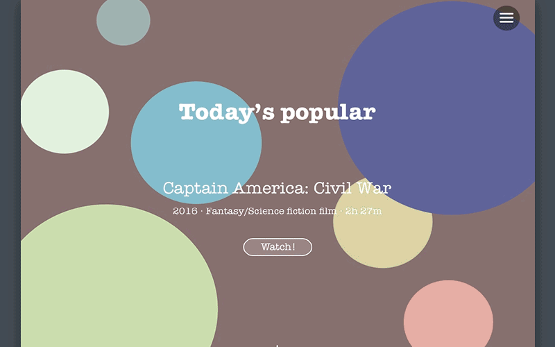
9 Tricks to Design an App Icon That Increases Your Revenue
What is a flat design for icon creation?
As far as the app icon is the reflection of our app's inner design, lets get familiar with some of the design basics.
So, flat design In short, it's by far the most frequently used word among UX/UI designers. Why? Because the IT world has gone nuts with flatness and simplicity whatever it comes to websites, operating systems, application, and so on and so forth. This approach is about creating simple two-dimensional designs without going deep into detail (think gradients, textures, and drop shadows). Roughly speaking, flat design is a play of icons, colors, and typography.
Flat design concept by Cleveroad
Many believe that the two-dimensional design is able to improve user experience on websites and mobile applications. No wonder why! First of all, it's focused on reading. Using non-complex icons and vectors alongside with clear sans-serif fonts, flat design makes it easier for users to grasp any content. Moreover, these heavily decorated icons and vectors don't always provide value to users. After all, clearness is what people usually need.
Second, getting rid of unnecessary styling means forgetting about slowly loading applications. With the absence of all these skeuomorphic details, flat elements are smaller in file size. It wont be hard to guess that designs with a small size load way more quickly than their bigger fellows.
Finally, flat design is the last thing in web and mobile development. Take a look at the giants like Apple and Microsoft, they adopted it years ago. And I think what we use now looks much more attractive than ever.
Flat design concept by Cleveroad
What is a material design for icon creation?
It's worth mentioning (in the first place) that material design is rather a branded product than a universally adopted philosophy. That is to say that this design approach was set up by Google, all it's guidelines were defined by Google, and all further changes to it's concept should be agreed with/approved by Google.
You may want to ask about the distinction between flat and material designs, because, actually, they look very alike. Well, it's quite reasonable. Indeed, the untrained eye could barely find the difference between these two. In fact, it lays in details.
Material design concept by Cleveroad
Material design can be aesthetically flat, especially when it comes to colors, but it stays multidimensional in the end. The truth is, the main aspiration of material design is to combine a real world and digital graphics. It smells physics (in a way). Thats why we still can see there some skeuomorphic parameters like shapes and shadows.
The reason why Google propagate this app design approach may seem clear: it's an attempt to unify the way things look on different Android devices. And material design guidelines do well at this question. So here comes the main difference between material and flat designs: the first one is strongly believed to be a straightforward concept, whereas the second one is a product of several design practices moving towards minimalism and plainness.
Believe it or not, Google states that it's not after designers to follow the material design guidelines blindly. So a dash of disobedience is OK sometimes (within the limits of reason, of course).
Anyway, Androids vision of skeuomorphism differs a lot from the one Apple laid aside with the release of iOS 7, doesn't it?
IOS vs Android icons set
As you might have already guessed, the main idea of Googles material design is to imitate the real-world shadows and shapes, the icons on the right look way more minimalistic compared to the ones existed in iOS 6. In other words, however hard two competing platforms try to lay stress on their distinctions, the fact remains that total simplicity is the hottest trend in application design nowadays. Thus, it is the first thing you need to aspire to.
Need more information? Learn the difference between Flat Design and Material Design in our detailed research.
To prove that the abovesaid wasnt mere rhetoric, take a look at the set of new Google Play family icons presented by the company at the beginning of April. It seems that Google is moving to simplicity in leaps and bounds without even realizing this fact.
Google's icons set
9 Tricks to Design a Captivating App Icon
Trick #1 Be as simple as possible!
Of course, Google and Apple confess (or pretend to do so) two different design religions and have their own specific doctrines as for the app icon appearance nevertheless, we made an attempt to come up with the formula which will be universal for both mobile platforms. And this is the first part of it being simple.
By this, we imply being aside from mixing loads of colors and images in a single icon. Don't try to stuff it up with all features of your application. Wed advise focusing on your apps concept better. One (but memorable) element is still the best idea for your application.
Warning! Gaming apps are the only exception in this case. Why? Because game vendors may want to show off their rich graphics and vivid characters. But again, don't go too far with the boasting of the inner world of your game.
Icons for game apps
Trick #2 Be unique!
You will always be aligned with other products whether a user is browsing through the app store search results or scrolling through her smartphone home screen. There are two options, though: your icon will be either mixed up with the crowd or stand out dramatically. Not to let the first one happen, lets use memorable shapes and symbols. Not only do they grab users attention, but also are recognizable at a glance.
Memorable app icons design
Warning! The size of your icon may vary: it's larger in an app store, smaller on the home screen, and even tinier in the notification center. So make sure your app icon looks great and comprehensive at any size.
Trick #3 Avoid using text blocks!
One symbol or your logo is just enough to make a good impression. So do not try to compress the whole caption into one picture, it almost definitely will look heavy and unattractive. But don't be sad, you can always give an explanation inside your app.
Single-letter logo
Trick #4 Use bright colors!
The icons above are good examples of what we call a great color mix. So the first rule is to find shades that will complement each other and make a perfect match. Actually, thats the topic which needs a separate article to be written, because colors have by far the biggest influence on users behavior and social psychology in general. So you need to act cautiously to make sure your message will be delivered right. In case you want a more in-depth analysis, go straight to Wiki.
Exploring design guidelines by Apple and Google: best practices and Cleveroad experience
Anyway, it's preferable not to make a multicolor spot out of your app icon. Choose a limited color palette. One or two colors are thought to be a happy medium for creating a nice icon for your application.
Trick #5 Don't ever use photos!
Photos and screenshots are not advisable when it come to the icon design. Thats because photographic details are almost sure to look unintelligibly at smaller sizes. So it would be better to reflect reality in an artistic way. But don't forget that we are currently trying (and so is the entire world of IT) to move from skeuomorphism and overly realistic design.
Instagram icon redesign
Trick #6 Portray real substances accurately!
Although, if youve decided to make a more real visualization, then you need to do your best to interpret objects it in the most precise way. Textures, shapes, and shadows all these need a careful consideration. And again, Googles material design guidelines are at your service.
Trick #7 Avoid transparency!
Thats because the icons borders smaller than a required size or transparent areas created deliberately can result in your icons getting lost on a dark or extremely bright (multicolored) background.
Trick #8 Resort to A/B testing!
Talk about colorful backgrounds, we want to warn you that your application icon may not look as attractive on a painted wallpaper as on a sole-colored one. So youd better try it out on different surfaces, including pastel and juicy ones. Whats more, you can try grouping a few of your designs in one folder and check if their tiny versions look well there.
Even better, you can submit several versions of your app icon to beta testing on services like PickFu. Doing so, you can find out which of your works will catch on.
Trick #9 Don't steal from other vendors!
First of all, it doesnt seem to be cool. Second, it can lead to your artworks being confused with the ones of other developers. And third, app icons are usually subject to copyright and cant be reproduced in other icons and images. But drawing inspiration from really successful applications is always welcome...
So now you are two steps away from the coolest app icon ever. The only thing is left hire a gang of real professionals. We are here! So don't waste your time browsing through the web and drop us a line. Turn to us with your ideas and let's create something special together!
Don't forget to subscribe to our blog is your want to receive the most relevant and up-to-date information directly to your email inbox.

Evgeniy Altynpara is a CTO and member of the Forbes Councils’ community of tech professionals. He is an expert in software development and technological entrepreneurship and has 10+years of experience in digital transformation consulting in Healthcare, FinTech, Supply Chain and Logistics
Give us your impressions about this article
Give us your impressions about this article