Creating Design: Interface Guidelines, Best Practices, Cleveroad Experience
Updated 24 Mar 2023
11 Min
4084 Views
Mobile app design is one of the fundamental points to which you should pay attention when deciding to fill in the shelves of the mobile markets. Not only will the quality design attract customers but make it so that they will not want to leave the application for a long time. But how to create a design of the app? At first glance, it may seem that this process is highly creative and does not allow any sort of the rules and regulations, and this is partially true. However, the familiar design of some elements may be more acceptable to users and look more professional and harmoniously within a particular operating system.
For this purpose, Apple and Google have created their guidelines as for how the application design for a particular platform should look like. iOS Human Interface Guidelines and Android Material Design represent the sets of recommendations and suggestions. The designers have the right to follow or not to follow these recommendations when taking certain decisions, though.
Further in this article, we are going to consider the feasibility of using or not using the guidelines for user interface design, as well as their combination. Also, we will try to identify the most common mistakes which might be made during the design creation. Basing on our experience, we will suggest the ways of their avoiding.
What are the design guidelines for?
Having decided to make an app, you might come across a question: "Should I use the guidelines?" The answer is: "No". Remember that the user interface guidelines are only recommendations and you are not obliged to follow them. However, taking the guidelines into account does give you obvious benefits, particularly:
- you can greatly simplify your life, as many points that you were going to think over are already designed and supplied for you;
- your app will not look completely alien on the OS you design for;
- you still can use your imagination as the mobile app design guidelines do not require that you follow them blindly.
UX rather than UI
What is important about iOS/Android design guidelines is that their main purpose is not forcing you to use green, blue or whatever colors so that all the apps look identically but provide an effective and convenient user experience.
Let's consider an example. Take a look at your phone.
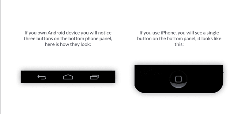
Obviously, the "back" button should be included into iOS application but it's not necessary if you deliver Android app development services.
This is what the UX stand for. Not only should the users be surprised with the nice look but feel comfortable when using your application. Proper placement of the buttons, the sequence of pop-ups, the ability to easily use the application for the first time and at a later stage are the keys to the success. To do this, you have to take into account the peculiarities of the platform for which the application is going to be created. This is when the guidelines are of great importance.
Creative flexibility
Your imagination is still in charge of creating an app which is going to stand out from the crowd. Not only can you design your own elements but mix the existing ones provided by Apple and Google.
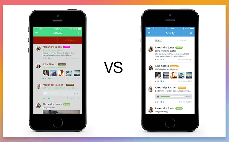
Even though Material Design was created primarily for Android apps, and Human Interface Guidelines were revealed for iOS applications, it does not mean that you cannot combine them. You may perceive these user interface design guidelines as two different visions on the app's look and choose what suits you the best way. Be careful not to cross the red line, though. It is unacceptable to copy the Android look into iOS app or vise verse but you can consider adding some elements described in the Material Design into the application which is going to run on iPhone. There are many apps made this way in the mobile markets. As an example, let's take a look at the Facebook iOS application, particularly at the following options:
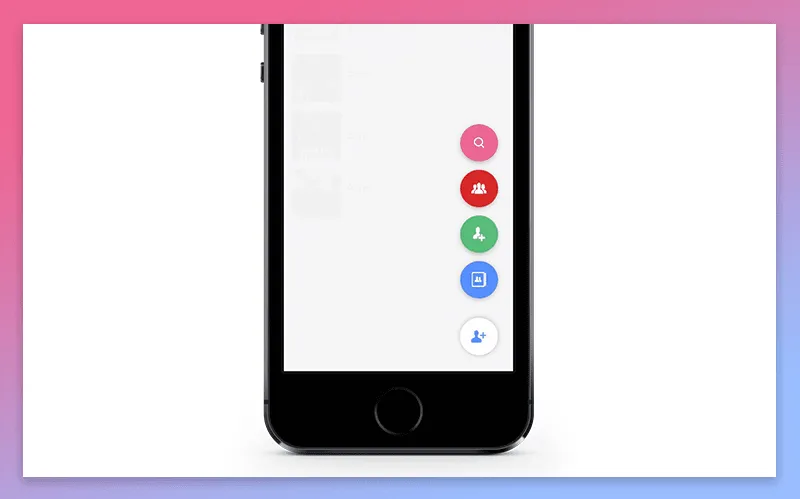
As you can see, the Floating Button element is implemented in the Android guidelines style. This does not prevent it from looking good on the iOS device.
Rules matter
As you may have noticed neither Apple nor Google are going to limit you in creativity. But do not forget that to adhere to the basic standards is essential if you do not want your application to look ridiculous for a user accustomed to a particular operating system. This is when the mobile design guidelines may really serve.
Here are the key points which you should pay attention to:
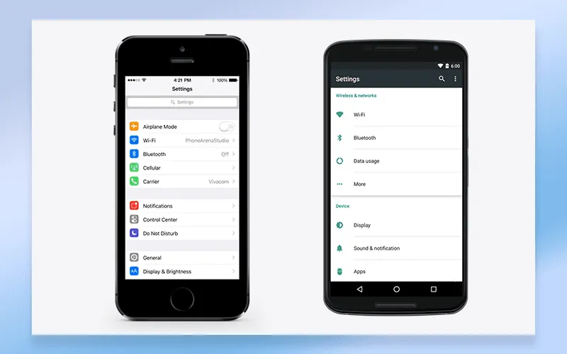
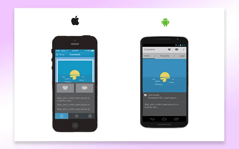
Search option
iOS applications usually contain a separate search field, whereas in Android applications there is a magnifier sign by pressing which the search can be enabled.
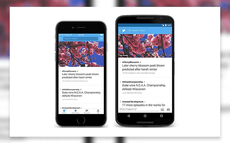
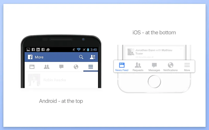
Tabs
In the iOS applications, the tabs are usually located at the bottom of the screen. Android apps tend to locate them at the top of the screen below the action bar.
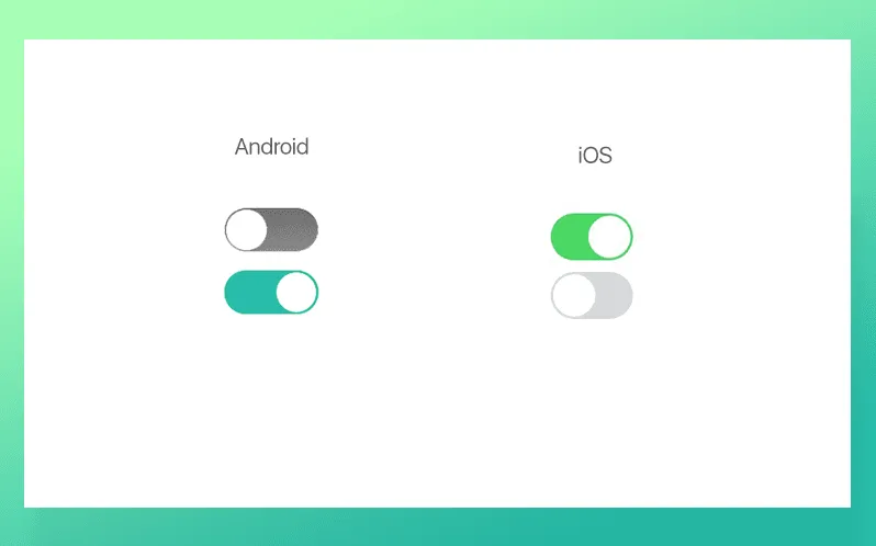
Switch buttons
iOS switchers are wider with a characteristic light-green color. Android switchers are more narrow and of a different color palette.
Lists and Settings
There are usually right arrows presented in the iOS lists, however, Android lists do not employ them, as a rule.
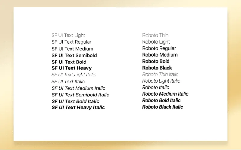
Fonts
The latest iOS version has opted for San Francisco font, Android applications usually use Roboto font. Find out more about iOS and Android fonts on the corresponded official pages.
Icons
Both iOS and Android operating systems have specific icons. Using non-related icons may look unfamiliar and confusing for the users. Following iOS and Android icon guidelines is highly recommended in this matter.
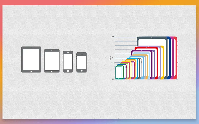
Consider metrics
Designing an app it is important to consider the sizes of the device. It will be easier understanding application design cost and development time. Both iOS and Android have numerous phones and tablets with different measurements and screen resolutions. Note that the number of Android devices greatly exceeds the number of iOS ones. Make sure that your app looks good on each device where it can be installed.
See also: 9 Differences Between iOS and Android App Development
Possible mistakes
Quality design is not limited solely to iOS or Android recommendations. Given that the number of mobile applications increases day by day, you can imagine how many designers have already puzzled over the question of a nice-looking and easy-to-use application.
Basing on the international practice and their own experience, the Cleveroad designers have arranged a list of the most common mistakes. Take them into account when creating a design or accepting a finished work from the hired development team. Here they are:
Applying too many colors
Consider the sparing usage of colors to highlight important information. It is advisable to choose not more than three main and three secondary colors.
Using inappropriate or too many fonts
Selected fonts should harmoniously complement the design of the application. Using a large number of fonts may confuse users.
Confusing asymmetry with imbalance
While asymmetry is acceptable and even interesting design technique, the imbalance may look rather unattractive. The professional approach requires following a basic logic in this matter.
Filling all the space with text or other elements
Straightening the content over the entire page makes it look cluttered. You should group the related components but place them so that a certain part of the page remains blank. This will help you to create a contrast and move users' eyes into the right direction.
Including images beyond the layout
Such approach may lead to the unprofessional look of your application. Frames, structure, layout are to be used during the images arranging.

Designing an app in a typical iOS or Android style
You need to find the line between a clear incompatibility and blind imitation of standard applications. Your app should look fresh, attractive, unique. For that, try to transfer OS design language into your own look and feel.
Making an app identical across all the operating systems
This approach is totally wrong as users increasingly expect to see a relatively familiar and convenient interface rather than the identical location of the app buttons running on different operating systems.
Trying to make it complex
Everything of genius is simple. This is true for the design as well. Do not overload your app with unnecessary elements or fancy color schemes. Keep it clear and simple.
Good examples
As you know, a picture is worth a thousand words. That is why we would like to share a few apps which, in our opinion, may be considered the examples of a great design work:
Periscope is a great app for streaming video. Designed in calm blue colors it is very gentle to your eyes.

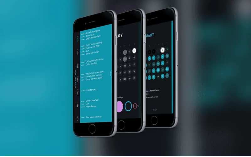
Moleskine Timepage is a calendar app to manage your everyday affairs. A beautiful combination of dark background with bright colors of other elements. ?onvenient placement of buttons and intuitive interface.
Robinhood is an app for investors who only start their business. As befits a financial application, it has no frills. Strict white background, combined with green and black makes it pleasant to look at. User-friendly interface allows to quickly understand the basic functions.
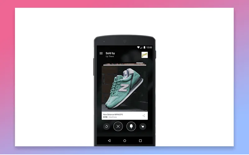
Fancy is an application for searching products and creating a list of the products which you want to buy. Handy buttons are located at the bottom of the screen which allows users to quickly and easily search for the right products. Moderate colors do not distract from the main functional.
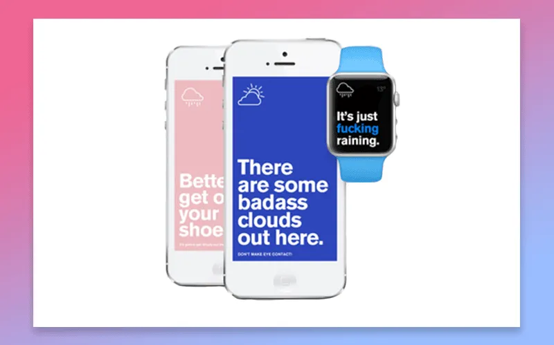
Authentic Weather is a creative application to determine the weather. Minimalist, concrete, with elements of humor, it clearly conveys the needed information to the users.
Things to learn
The design can and must be individual, attractive, and creative. No one wants to download an app which is totally identical to the other applications installed on the device. However, there are some aspects which do not refer to the creativity but to the convenience of usage and suitability to the operating system. This is where you should not depart from a rule.
Follow the visual design guidelines and world best practices to make your app look harmoniously both on iOS and Android devices and use your imagination to make it stand out from the other applications in the mobile markets.
Contact us immediately for any further questions as for mobile app design. We are open to the collaboration!
By the way, check out our Dribbble for inspiration!

Evgeniy Altynpara is a CTO and member of the Forbes Councils’ community of tech professionals. He is an expert in software development and technological entrepreneurship and has 10+years of experience in digital transformation consulting in Healthcare, FinTech, Supply Chain and Logistics
Give us your impressions about this article
Give us your impressions about this article