Responsive Web Design vs Adaptive Web Design. How to make your choice?
Updated 28 Aug 2023
9 Min
5138 Views
The variety of devices to surf the Internet is growing progressively. And so is the need to create solutions which can meet the requirements of all the diversity of browsers and screen sizes. Designers and developers have to make these decisions almost every day. For example, which approaches they are going to use to create another cutting edge product to satisfy the users, who become more and more demanding!
In this article, we will delve deeper into the definition of responsive and adaptive mobile web design services, what their differences are and how to choose which one to follow. Both responsive and adaptive design strive to accomplish the same task. A website should look great on any device, whether it is a mobile phone, tablet or a laptop running any browser: Google Chrome, Internet Explorer, Mozilla, Safari and so on. Despite the same aim, there are different methods within these approaches.
Responsive vs Adaptive Design: Which's Best for You?
Mobile responsive design - what is it?
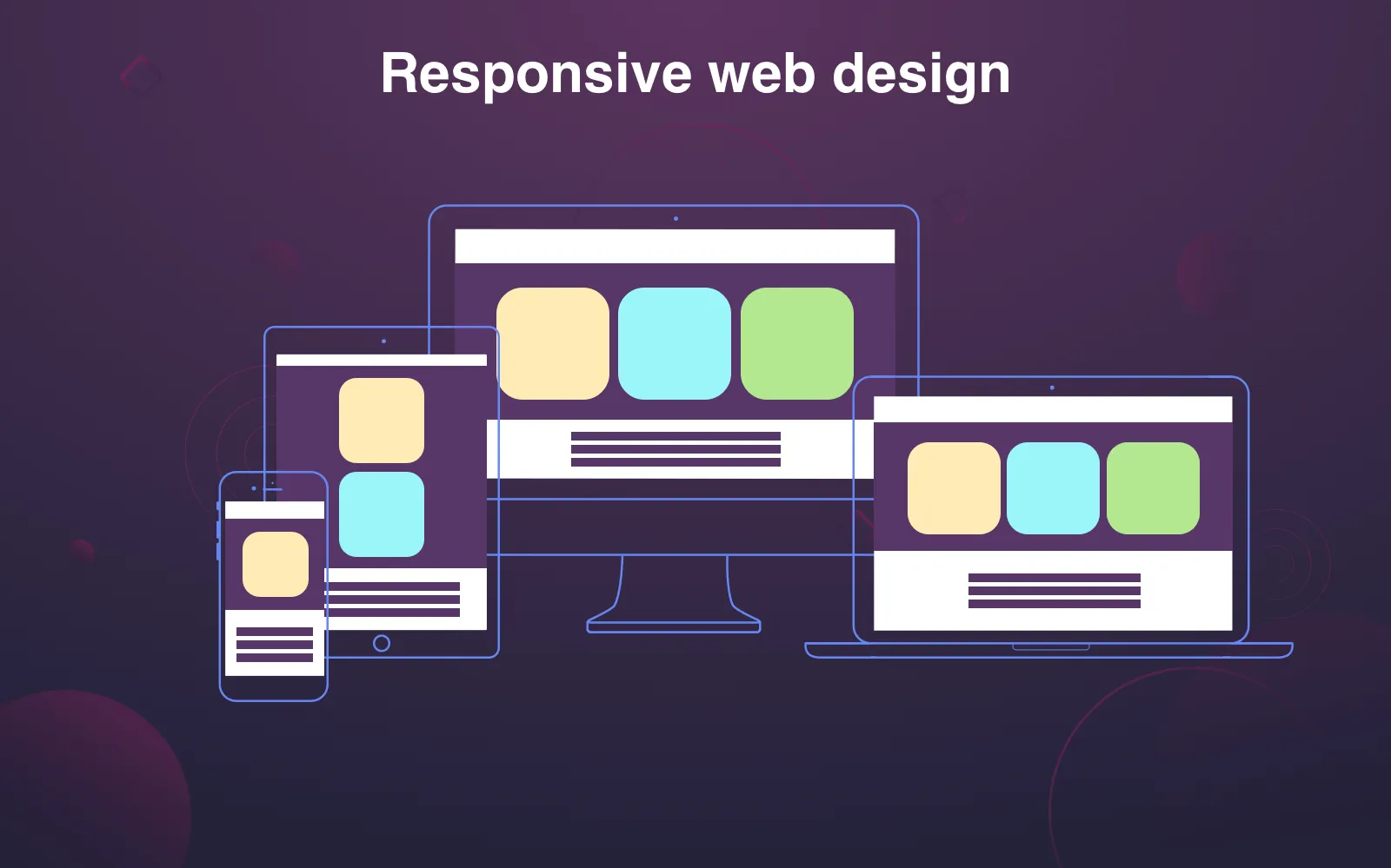
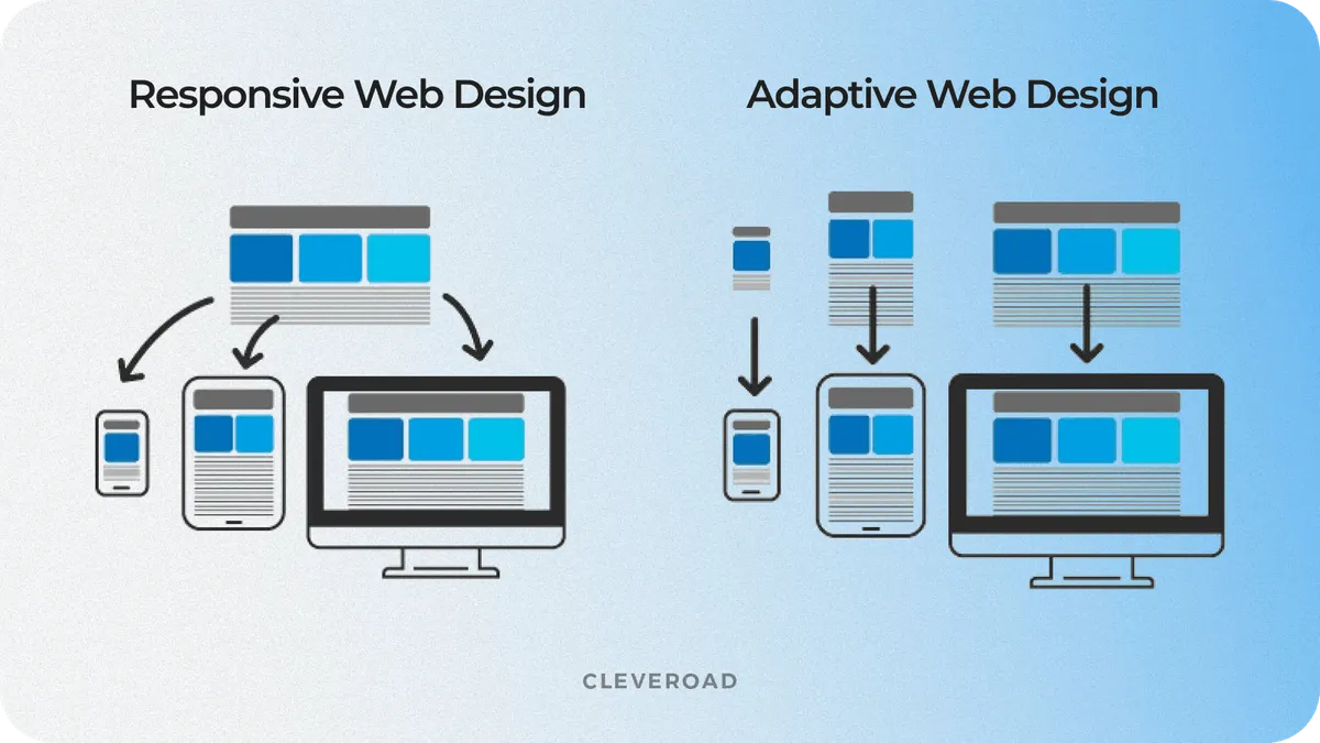
The world heard about RWD (responsive web design) for the first time in 2010, when a designer named Ethan Marcotte mentioned this term in an article and later wrote a book called "Responsive Web Design", which is still considered the most credible source on this topic. The idea of RWD is that you have one website for all devices and browsers, which where the content is like a water and shapes perfectly according to the browser's screen size.
Ingredients for responsive mobile design
According to the responsive design, websites must have the following components:
- One flexible layout
- Flexible media
- Media queries
Grid-based (flexible layout) allows you to adjust one layout to different devices and browsers, where the content changes proportionally to the screen size.
The trick is that instead of pixels you use percents and em for fonts. The site page will change relatively to the size of the browser window, and the elements will adjust proportionally, e.g. if a certain column takes about 60% of the page, it will stay this way whether it is a desktop size or a mobile page size. Of course, changes should be reasonable. If there are 3 columns on a website, it makes sense to show only 2 or even 1 of them on the mobile device at a relatively small size. There is a point to set a maximum width, though, not to make your responsive site look ridiculous on a huge TV or laptop screens.
To find out more about the latest design tendencies, see also: Flat Design vs. Material Design: How Different They Are
Flexible images (media) an image changes proportionally according to the relative blocks but never becomes wider than the block where it is situated (maximum width must be appointed to all pictures, videos, etc). This component is a must for mobile responsive websites.
Media queries are a part of CSS standard. They are used in responsive web development to optimize a picture according to a certain device's screen resolution, where the website might be opened.
Mobile responsive website summary
Mobile Responsive design doesn't really care about devices. It's main aim is to make a website which automatically conforms to changing browsers' sizes and has one set of code. How do you know that the site is responsive? You just drag your browser's corners to emulate different screens. If the content starts to shrink smoothly and continues to look good as it becomes smaller, chances are you have a mobile responsive web design.
Responsive design
What is adaptive design?
Another approach to creating good looking web products which adjust their design to different screen sizes and browsers is to follow the adaptive design.
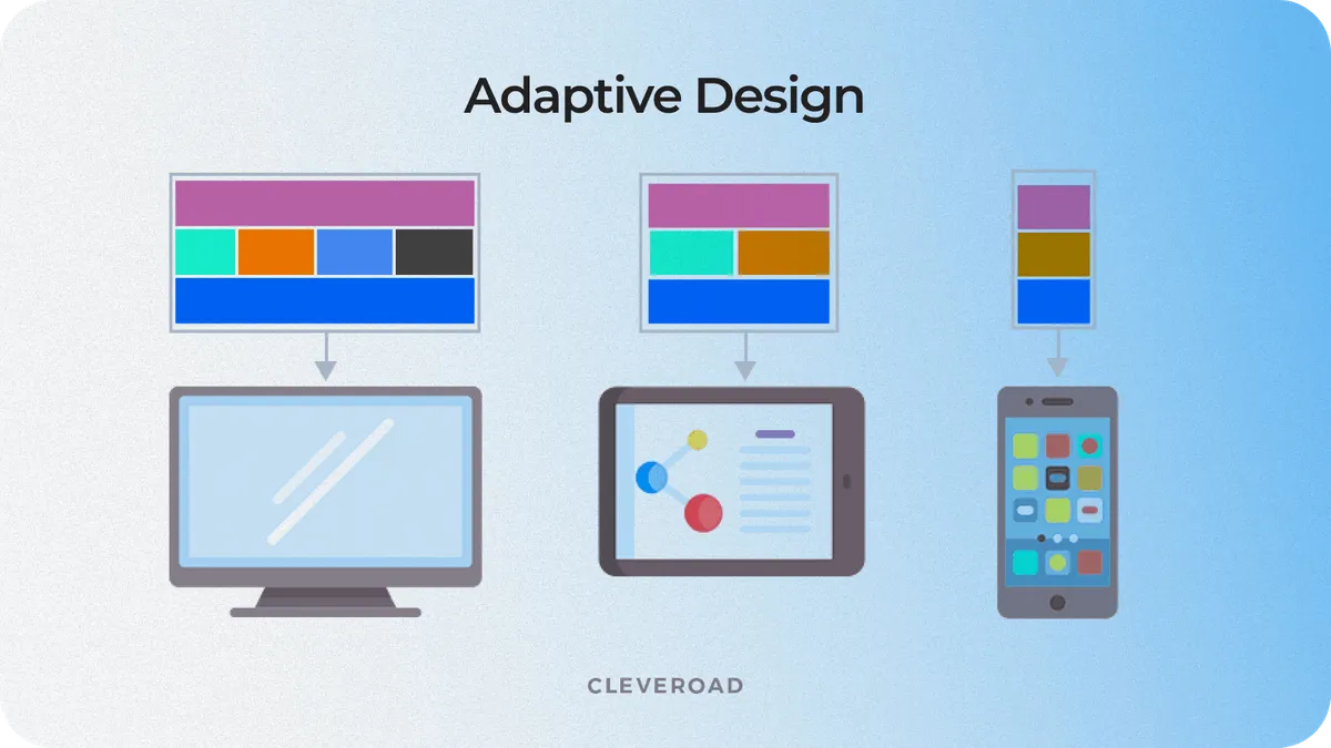
The world got the term adaptive web design (AWD) after Aaron Gustafson's book publication "Adaptive Web Design: Crafting Rich Experiences with Progressive Enhancement". The main philosophy of adaptive design is creating the best user experience, where a website is accessible without any technical restriction. This approach also takes for granted that the website will adjust to different devices or browser's width and uses the same technologies as responsive design. But still, it's very different comparing to the RWD. The web page developed within AWD will change step by step, but not in a liquid way (though, you may inject some liquid elements of course). The adaptive design is based on operations with different layouts and certain pre-specified devices and screen resolutions. This is a very smart idea because, besides laptops, tablets, and smartphones with a huge variety of screens sizes, we now have enormously big TVs, watches with tiny screens, onboard computers, all of which can have access to the Internet.
Within the adaptive design approach, you should decide who your main audience is and what types of devices might be used on your website. This is important because, as it was mentioned above, it's not possible to create only one layout for different variants within this method.
Adaptive design strategies and techniques
The AWD uses progressive enhancement and graceful degradation strategies of development within it's approach.
According to the progressive enhancement strategy, you start creating your website which meets all requirements of the oldest browsers, like Internet Explorer 8. And then, step by step, you create a website which looks great on the most contemporary and powerful browsers. This strategy is considered the best choice if you strictly follow the adaptive design principles.
Graceful degradation is another strategy within the adaptive approach. The strategy achieves the same goal (as the progressive one) but in an opposite way. You first create a website which looks the best on the most used and contemporary browsers and then simplify it to make it appropriate for the oldest browsers.
The progressive enhancement strategy is very handy to follow: at the end of each stage you get a website which works and looks good on a browser. Within each step you get a fancier product, using HTML markup to show simple static content and CSS with Javascript for a more dynamic look. The priority of such a strategy is that you can quickly get a simple, yet complete product.
If your priority is mobile development, the Mobile first principles will be helpful in this case. The term derives from Luke Wroblewski's book. The concept is very close to the progressive enhancement principles but refers to mobile web development only. The website is first designed according to it's look on a mobile phone. All content is placed into one column usually and has a compact and concise design. And then the site is developed for other devices, getting more content and dynamics. Following mobile first principles for your website development, you can get a full-featured product, which will look appropriate on a laptop too.
Main components and principles of the Adaptive web design
Adaptive design summary
Websites which are developed according to the adaptive design principles are supposed to have the following peculiarities:
- Delivered content is different on different devices.
- Multiple sets of templates.
- Different design for different types of devices.
If the website you look at on a mobile phone provides you with different functionalities, for example, you have a button "call to make an order" on a mobile version, while there is a button "write us an email" on a desktop website, it must be an adaptive website.
Although, it's important to mention that there are a lot of discussions about the definition of responsive and adaptive design. But according to it's origin, responsive design has a flexible layout and a "one-size-fits-all" HTML markup, while adaptive design strives to provide it's users with customized products by means of using different layouts for certain groups of devices and auto-detection script to identify the type of device.
Comparing the design strategies
Responsive web development
Benefits
- One URL for all versions of your site makes it's promotion much easier.
- Google considers responsiveness as mobile friendly and helps to improve your SEO rates.
- Distinctive look on various devices.
- Creating a responsive site alongside it's maintenance is a much easier and cheaper process.
Negative moments
- Too much content on a mobile screen sometimes.
- Impossibility to create a customized product for all the diversity of contemporary devices.
Adaptive web development
Benefits
- Better targeting process as a server defines the type of device and uploads the appropriate version of your site.
- The possibility to create a good looking and customized website for the particular type of devices with predictable behavior.
Negative moments
- More expensive and complicated development process.
- More complicated update and maintenance process.
Responsive design vs Adaptive design
Responsive or Adaptive: Key statements to take into account before making the final decision
Responsive websites are a good idea if:
- You are limited in time and financial resources.
- You have a simple clean design and functionality without the necessity to adopt it to various needs.
- You aim to increase the speed and ease of maintenance and the update process of your website.
Adaptive websites will be a great choice if:
- You are absolutely sure that you need an audience with a wide spectrum of devices.
- You have both time and financial resources to create and maintain several variants of your product.
Read if you want to find out: How to Choose between Mobile Website and Mobile App.
Last but not least, we wanted to mention that none of these approaches are better or worse than the other. Again, the choice is yours. As long as you remember to put the development process first, you'll prosper, as well as have some happy customers!
We hope that after reading this article you now have a much better understanding of the topic and it was helpful making your choice.
If you need some further consultation or are ready to start working on your project, don't hesitate to contact us!
Take a look at some of our works on Dribbble.
The main philosophy of adaptive design is creating the best user experience, where a website is accessible without any technical restriction. The web page developed within AWD will change step by step. The adaptive design is based on operations with different layouts and certain pre-specified devices and screen resolutions. This is a good idea because, besides laptops, tablets, and smartphones with a huge variety of screen sizes, we now have enormously big TVs, watches with tiny screens, onboard computers, all of which can have access to the Internet.
The world heard about RWD (responsive web design) for the first time in 2010, when a designer named Ethan Marcotte mentioned this term in an article and later wrote a book called "Responsive Web Design", which is still considered the most credible source on this topic. The idea of RWD is that you have one website for all devices and browsers, where the content is like water and shapes perfectly according to the browser's screen size.
Here are the benefits of responsive design:
- One URL for all versions of your site makes it's promotion much easier.
- Google considers responsiveness as mobile friendly and helps to improve your SEO rates.
- Distinctive look on various devices.
- Creating a responsive site alongside it's maintenance is a much easier and cheaper process.
Here are the advantages of adaptive web design:
- Better targeting process as a server defines the type of device and uploads the appropriate version of your site.
- The possibility to create a good looking and customized website for the particular type of devices with predictable behavior.
Here are the downsides of responsive design:
- Too much content on a mobile screen sometimes.
- Impossibility to create a customized product for all the diversity of contemporary devices.
Here are the downsides of adaptive web design:
- Expensive and complicated development process.
- Complicated update and maintenance process.

Evgeniy Altynpara is a CTO and member of the Forbes Councils’ community of tech professionals. He is an expert in software development and technological entrepreneurship and has 10+years of experience in digital transformation consulting in Healthcare, FinTech, Supply Chain and Logistics
Give us your impressions about this article
Give us your impressions about this article