What Is a Design Concept and Why Do You Need It?
Updated 18 Aug 2021
7 Min
3034 Views
Concept development is one of the design techniques needed to create a User Interface for your product. At Cleveroad, we begin concept development after passing Immersion, Research, and Wireframes phases.
Thanks to this sequence, our design team already has answers to the crucial questions:
- Who is this concept for?
- What are the objectives of the product?
- Who is the target audience?
- What impression do we want to make?
That information lets us get to know your product better, while with ready-made wireframes we clearly understand the product’s structure and navigation.
Why Do You Need a Concept?
Concept is the foundation of your future UI/UX design. With its help, you’ll understand how the future product will look and feel.
At this stage, our team is open to your feedback and changes to design until the main scope of work begins. Before moving any further, the design team would need you to approve the concept.
Want to learn more about the design process? Here’s the comprehensive article covering the full UI/UX design process at Cleveroad.
Designers usually craft 3 to 5 screens in 2-3 variations to make this stage informative for you. These screens will show how the app may look like in the future.
There are two possible scenarios for concept development:
- You already have a brand style guide. In this case, designers work on the concept bearing in mind your brand guidelines. They’ll select a color palette, typography, icons, and illustrations based on those guidelines.
- You don’t have one. Designers create a visual style based on the data they got at the research stage (user preferences, competition).
Concept Development
Let’s take a closer look at what the concept is on the example of a project called GreenLight. It’s a dating app helping people find a soulmate or meet new friends. The core functionality is built around geolocation and match parameters set by users.
In this case, we already have the main color and the logo:
GreenLight’s logo
It’s clear from the logo and niche that the color palette should be bright. Now that we have all input data, it’s about time to initiate the concept development.
Step 1. Crafting a Mood Board
First off, the design team composes a mood board. It’s a canvas with a collection of images, interface examples, colors, and graphic elements. They all help to set a mood for the future product.
The mood board is an essential element of concept design. It’ll help to set the direction for the product’s style, color palette, fonts, and simply get inspired.
It can be a board with highlights on Pinterest:
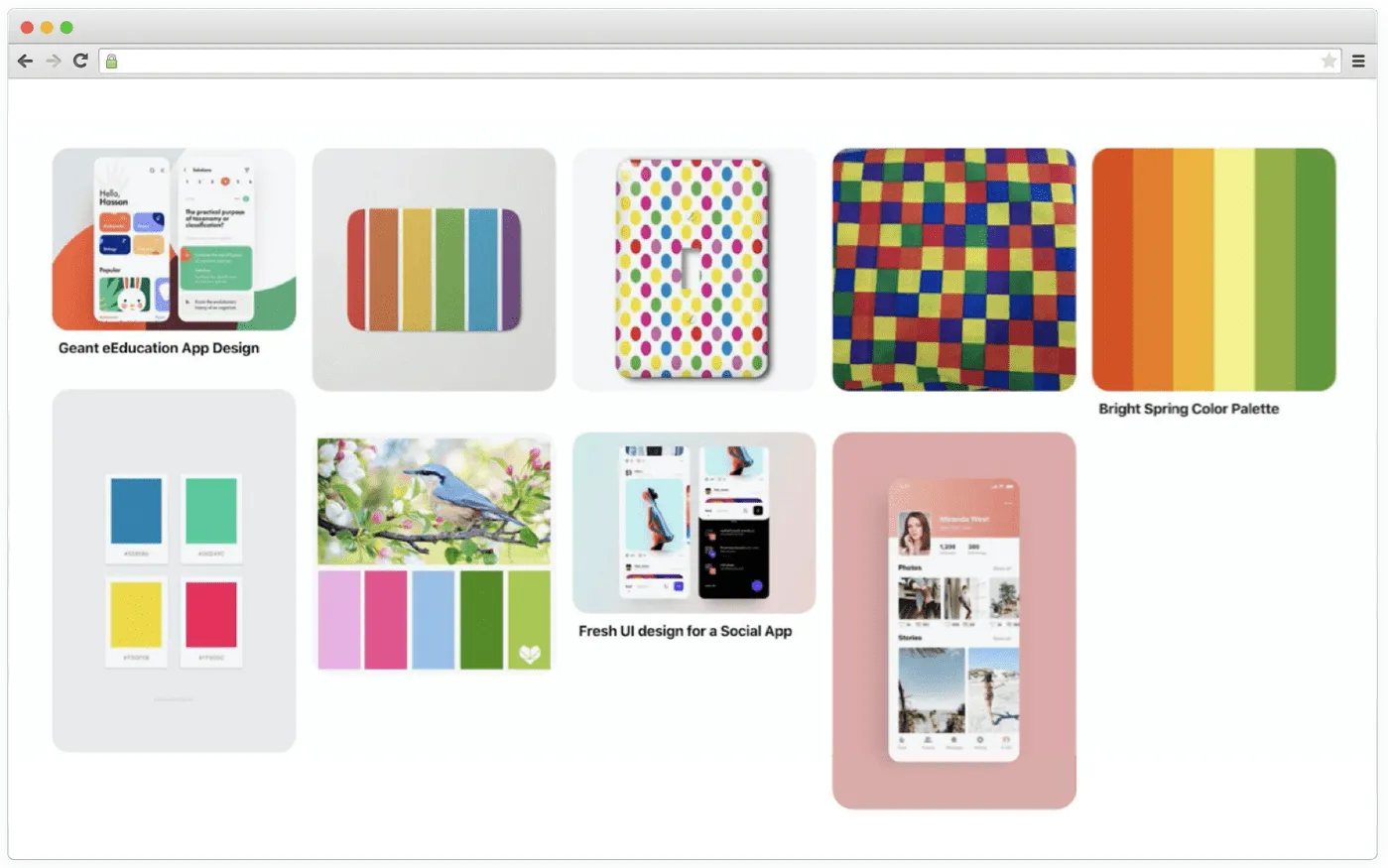
Example of a mood board on Pinterest
Or just a file storing different images and examples:
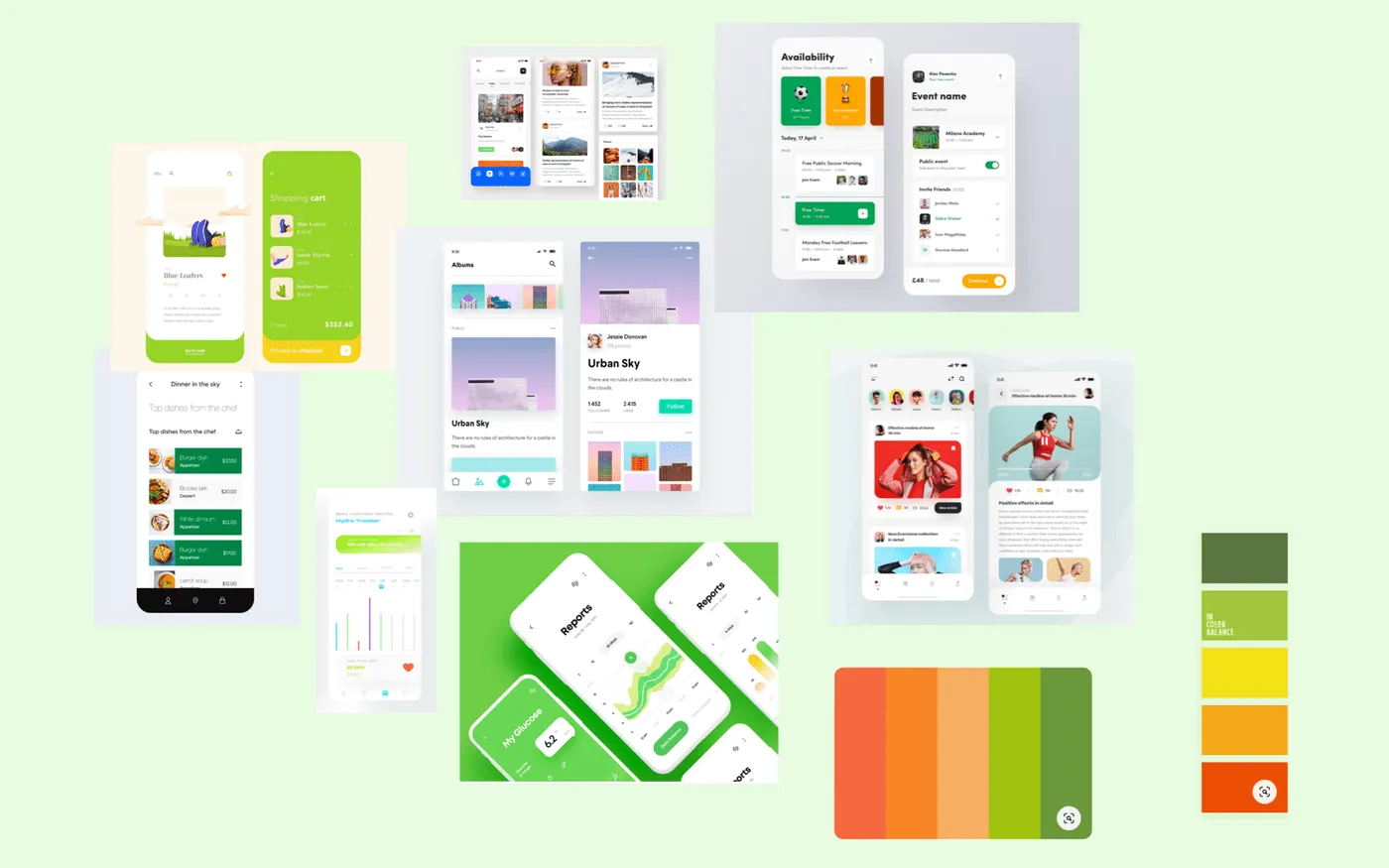
Example of a mood board on canvas
Thanks to these mood boards designers can see that the chosen green color is pretty bright. It means the product is going to be bright and clean. Also, the color palette boils down to additional red and orange tones.
How to make a dating app and succeed? Read our extensive guide and learn about steps to create a dating app, key trends, monetization strategies and cost
After analyzing design trends, we saw that rounded shapes were in trend. It’s important to find out how customers treat shapes. For example, rounded shapes evoke positive feelings and can be treated as a sign of love or friendship. It’s a perfect fit for this app.
Step 2. Selecting Colors
Next step is the color selection. Colors affect a lot on how customers will perceive your brand.
There is another small yet very important detail your UI/UX designers should bear in mind while creating a design — safe colors. When a computer or monitor can’t transfer a color accurately, they simply pick a similar color that can still be different from the one chosen originally.
To avoid this, we use a special color palette from 216 safe colors that are equally displayed on all computers and monitors.
There is a strong connection between colors and emotions they evoke. That’s why it’s important to understand what feelings you want your target audience to experience looking at the app.
The right colors can make customers remember your brand. In addition, if you want to win the attention of users, your product’s visual style has to stand out from what competitors have.
It’s also important to remember that each color has its own emotional background. For example, green color can be connected with peace, security, friendliness. Here are more details on emotional background for colors:
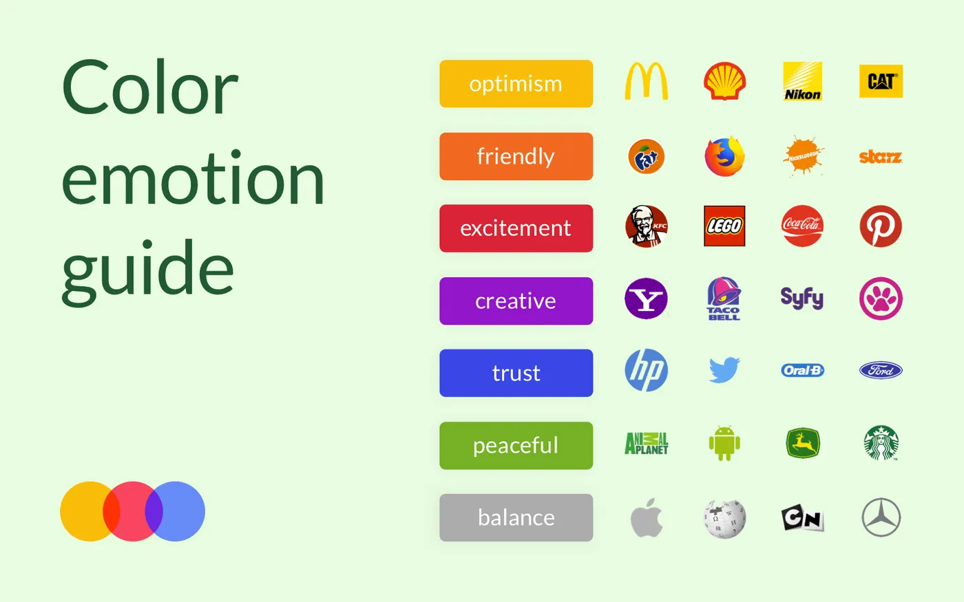
Colors and their emotional background
After selecting the primary colors, designers start picking suitable tones for them.
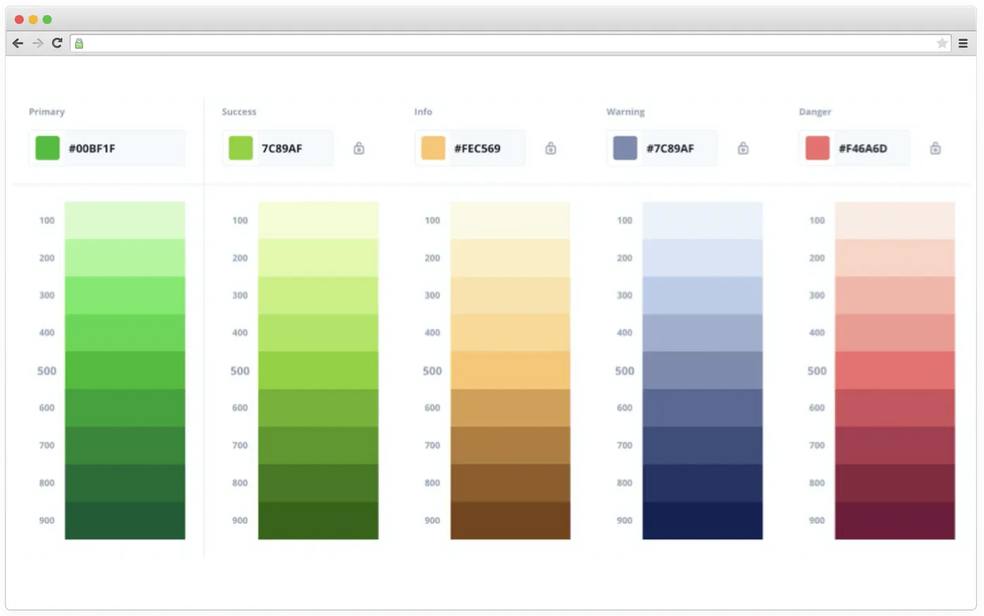
Tones of colors
Picking a color scheme, we also consider new features that may appear in future releases. This way, the User Interface and color scheme are both ready for new pieces of functionality.
Step 3. Selecting Fonts
Once everything is clear with colors, our team gets to fonts.
It’s important to pay attention to context to pick the right font. Just like with colors, every font has its own ‘mood’. It can be playful or strict.
If your product is about long texts, it’s vital to pick a font with clearly visible letters making texts easily readable. Fancy fonts aren’t the best option when there are a lot of texts.
There are a plethora of tools that we use to select fonts and see how they look like in a context:
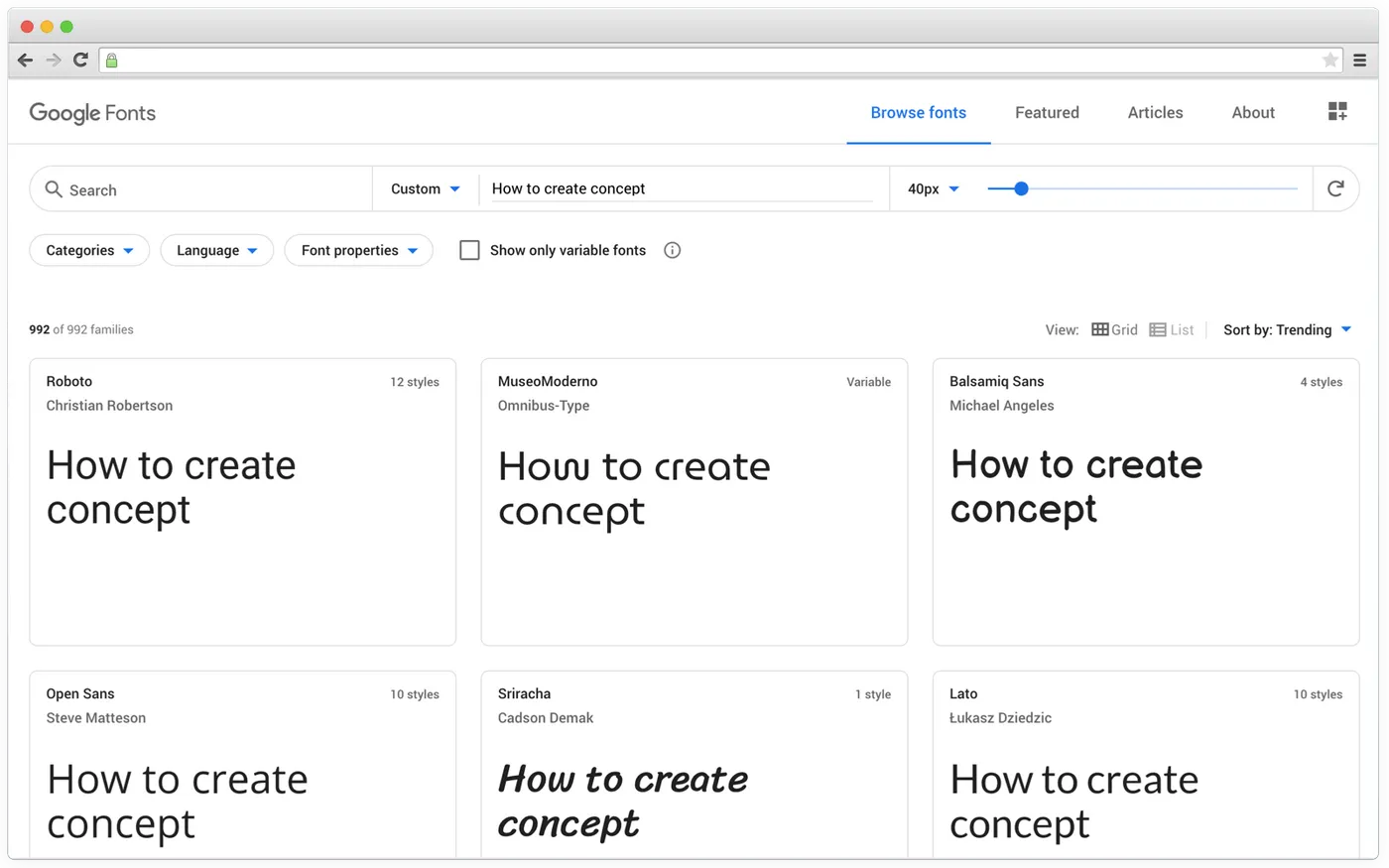
Google Fonts tool
For GreenLight’s concept, we picked a geometric font without serifs called Poppins. This font is rounded, which means it fits well with GreenLight’s interface using rounded shapes.
If the product is targeted at multiple markets, one of the main factors for choosing a good font is how it looks in different languages. We always make sure that the chosen font supports Latin or Cyrillic if it’s required.
In our case, we only need Latin and we can look through Poppins’ styles in context using Google Fonts:
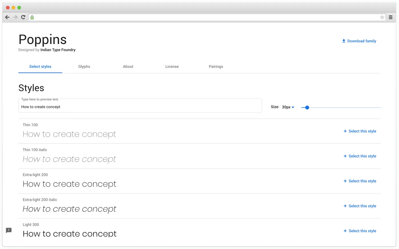
Font styles
Typography is essential for the overall look and feel of a product. It enhances the visual hierarchy, which has a direct impact on user experience.
Step 4. Putting It All Together
It’s the last step our designers do before sending a concept to a client.
By the end of this step, we create two concepts. They usually have different color palettes and layouts. In the case with GreenLight, we didn’t experiment with colors as we already had a palette based on the brand color.
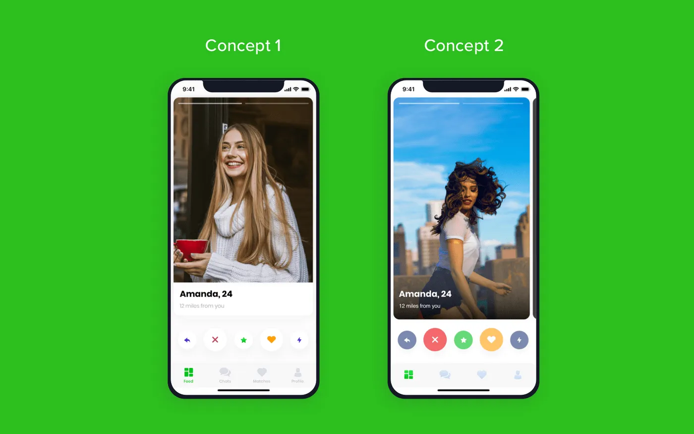
Example of concepts
As you can see from the example, we’ve shown different content layouts. The placement of cards with photos, colorfulness, styles of buttons, and a tab bar. They all differ to let clients choose what they like most of all.
It’s possible to combine these two concepts. For example, take cards with photos from the first screen and buttons from the second one. This way, the concept brings even more value for clients.
Wrapping Up
Summing everything up, we can say that there are certain criteria every design team should follow while developing concepts:
- It has to be straightforward. Goals and objectives were defined on previous stages. Concept development is meant to unlock and visualize those goals and show how the final product may look.
- Brief and concise. Designers create 3 to 5 main screens to unlock the main idea behind the concept. Designers focus on the main screen so clients could understand how the rest of the app will look like in the future.
- Feasibility. It must be possible to design and develop a product represented on the concept. What’s more, the concept should take into account the project’s budget, timeframe, and tech requirements.

Evgeniy Altynpara is a CTO and member of the Forbes Councils’ community of tech professionals. He is an expert in software development and technological entrepreneurship and has 10+years of experience in digital transformation consulting in Healthcare, FinTech, Supply Chain and Logistics
Give us your impressions about this article
Give us your impressions about this article