Designing for iPhone X: 9 Tips to Create a Great-Looking Application
Updated 11 May 2023
9 Min
8193 Views
Apple reveals new iPhones every year but usually they don't influence user experience as much as the iPhone X did. For designers, it's edge-to-edge screen with no home button means they have to build a convenient and easy-to-use iPhone X app design despite the fact users have never been faced with anything similar before.
No doubt, the only sure way to create the well-tailored app designs for iPhone X lays through the path of trial and errors. Still, there are several tips facilitating this way which we would like to share with you in this article.
iPhone X screen size: Take pixels under control
Obviously that the main changes that affect the process of design start with phone's edge-to-edge 5.8-inch display. The iPhone X screen became 20% taller if compared to iPhone 8/8 Plus that is equal to 145pt of additional space. So, be ready to use artboards sized 375 x 812 in your favorite UI design software.
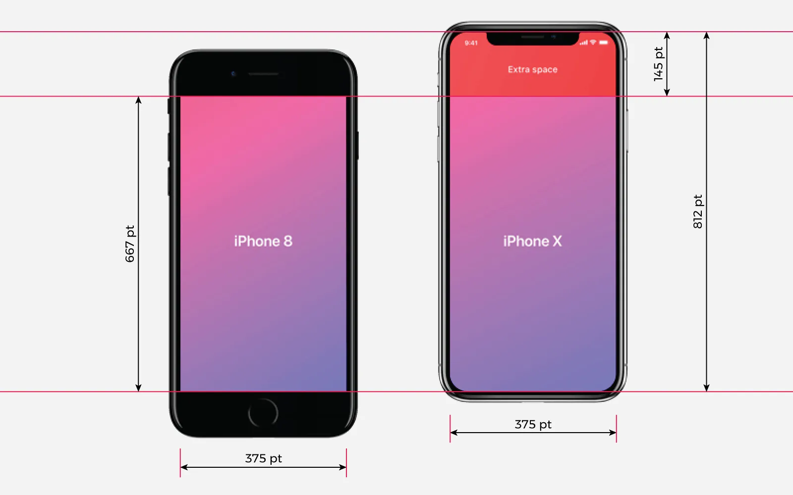
iPhone X screen dimensions compared to the iPhone 8
Let's skip to our piece of advice on how to better deal with iPhone X screen resolution while designing.
1. Realign the interface elements
If exclude all these standard bars on iOS that take some extra place on the iPhone X screen, we get an impressive 641pt of 'pure' height where you can place the content of your app. Why is it a big deal? Because the iPhone 8 has about 570pt of useful space for comparison.
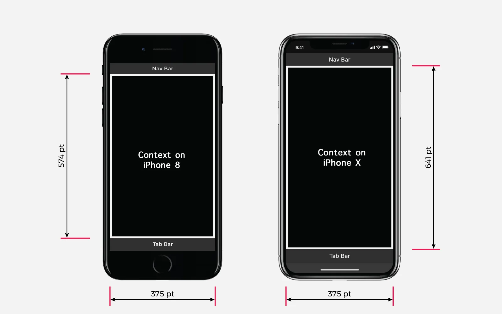
iPhone X resolution if compared to the iPhone 8
In terms of adapting app design for iPhone X, such resolution changes mean that you should rearrange the layout of interface elements if you want to preserve a pixel-perfect design of your app on the iPhone X. In other case, the elements may be placed too close to the notch that'll make the design look inappropriate.
2. Don't hide the iPhone X notch
Let's continue our advice-giving marathon by talking about the iPhone notch in screen since we already mentioned it. The notch or sensor housing, is probably the most controversial solution that intended to place all these brainy sensors. However, Apple had good reasoning for taking this step -- additional useful space on the screen. Besides, competitors didn't come up with something more elegant too.
Are you tired of time-consuming prototyping process? Check out these best prototyping tools to use!
What to do with this notch? Apple insists you to preserve the way it looks in your app design for iPhone X. In other words, you shouldn't mask it by coloring the Navigation Bar into black or trying to hide it in any other ways. The company says that the space at the sides of sensor housing gives some additional valuable space for content and status bar, so by hiding it you will make your app feel smaller.
Don't worry about your background elements like maps, colors, and others. They'll be gently clipped by smartphone's rounded corners and the notch, so your iPhone X app design won't be spoiled by any of these elements.
By the way, tell your iOS developers don't worry much about iPhone X app adaptation. Apple assures it's going to be ok since apps that use standard UI elements (e.g. tables, nav bars and so on) will adjust to the new form factor automatically. Concerning apps using custom layouts, the adaptation promises to be relatively easy in case Auto Layout was applied and you followed iPhone X safe area along with margin guides (we're going to talk about them further).
To preview the app and see how it looks like, you can use the built-in Xcode simulator. However, Apple stresses that some features including wide colors are better to preview on real devices.
3. Remember about the iPhone X status bar
The status bar becomes taller if compared to other models. For the sake of preserving a good look of the system, Apple doubled the iPhone X status bar height from 22pt to 44pt. In fact, it moved to smartphone's rounded corners on the screen. Apple notes that the status bar doesn't change it's height regardless of the background tasks that are currently switched on (e.g. location tracking, voice recognition and so on).
Do you want to learn more about interface guidelines? Then, welcome to our detailed article on this topic
Between, the company recommends you to refrain from using a custom status bar in your iPhone X app design and reconsider design solutions aimed at hiding it. Their key argument is that users expect this bar to correspond to the system appearance. Instead, you may use one of three status bars types provided by a system.
iPhone X status bar: Standard bars
Even though it's not advisable to design a custom bar, you can easily change colors to standard ones. This way, you can set up a new color for each screen or leave it unchangeable for all screens. It's applicable not only when designing for iPhone X but for any other model as well.
Take care of your app's content
In this case, size really matters. I think there is no point in explaining to you why the precise UI/UX design is so important. So, let's just look through some tips related to dealing with the content while designing for iPhone X.
4. Keep in mind the impact of colors
Apple inspires designers to refuse from using sRGB colors when creating the iPhone X UI design in favor of P3. According to Apple, such a step will help to take advantage of the wider spectrum of colors on the phone's display. In other words, your assets can be exported at 16-bit PNG if using the corresponding color profile P3. Unfortunately, this option is available only in Photoshop and it isn't supported by Sketch.
Bear in mind that not all displays can cope with this extra wide gamut of colors that P3 disposes of. In other words, many of them just won't display them, making it impossible to create accurate app designs for iPhone X. Talking about accurate displays, the Apple's iMac released in late 2015 was the first Mac-based computer that got the support of a wide gamut. Now, all the models of MacBook Pro which have Touch Bar inherited the support of P3.
5. Mind the iPhone X ratio
The iPhone X aspect ratio differs from previous models since it is taller. It means any artwork that looked good on previous iPhones may look strange in apps for iPhone X. This way, you put the app's content at risk to be cropped either letterboxed.
If the iPhone X content will be displayed on a device with the 4.5-inch screen, the app's content may even end up being pillarboxed. So, it's a good idea to consider using of different assets when dealing with aspect ratios that differ.
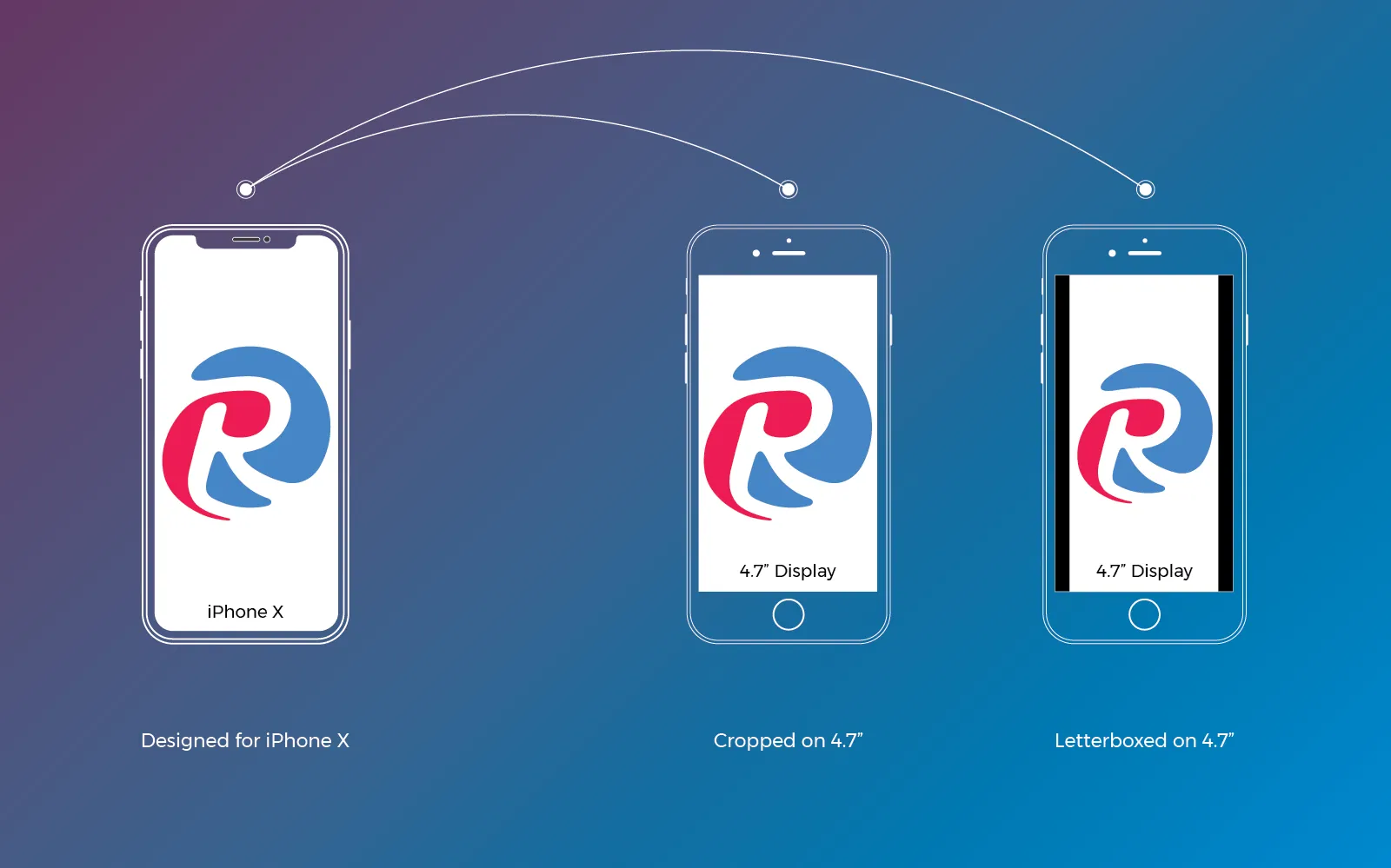
iPhone X screen aspect ratio: Pillarboxing and cropping
6. Be in love with the shape of screen
Yeah yeah yeah, not everyone is happy to see these rounded iPhone X corners, especially those people who have to create an attractive mobile design for the iPhone X. But still, it's a new way to experience mobile applications. However, Apple asks designers to refrain from masking this part of the screen either emphasizing it's shape peculiarities. That's how iPhone X app design may look like:
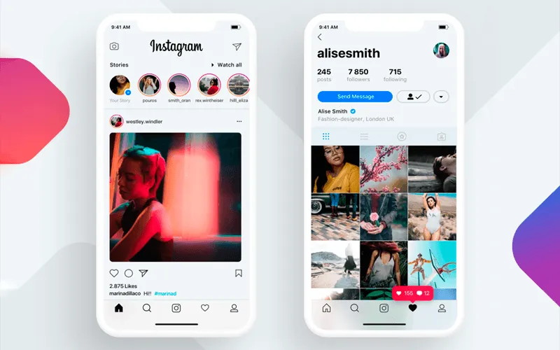
iPhone X Instagram app concept by Cleveroad (Source: Dribbble)
Follow iPhone X design guidelines
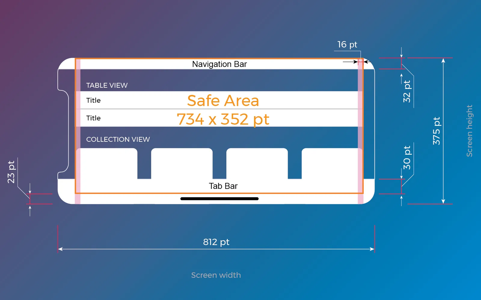
As I've already mentioned, the content in apps can be clipped because of the notch along with rounded corners of the screen. Sure thing you should avoid it when designing for iPhone X. For this purpose, Apple created it's Safe Area guides and told us how to place the content in apps without damaging it. If the background of your app shouldn't follow these guides, then other content like buttons, pictures, texts, and so on certainly should.
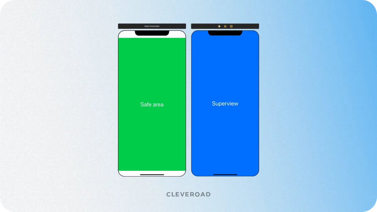
iPhone X Safe Area size
7. Think through the iPhone X landscape mode in apps
When the phone is turned to landscape mode the status bar is hidden in order to give the maximum space for the content. Besides, other bars are getting smaller. So, the navigation bar in landscape takes 32pt instead of 44pt, while the tab bar size reduces from 49pt to 30pt.
Despite the fact that not all apps need and will take the advantage of the iPhone X landscape mode, there are still a bunch of scenarios for it's usage. For instance, it's a good fit for viewing different sort of content like photos, videos, texts in full-screen. Remember that after users finished interacting with iPhone X turned to landscape, they should be able to easily switch to the portrait mode.
You should think about your app's design adaptation to the landscape mode, especially if your app is already adapted for iPads. Such an update can make the app even more convenient for users.
iPhone X landscape mode: Safe Area
8. Take care of website
There are chances that some of you created design not only for the app but the website telling users about it as well. With this reasoning in mind, we decided to cover some points related to websites in landscape in the iPhone X.
Do you need to build a website? or watch the video underneath
The Safe Area leads to lots of free space at the sides of your website when browsing in landscape. That's needed to avoid clipping of the content, so Apple created the separate guide in order to provide us with the knowledge on how to adapt websites.
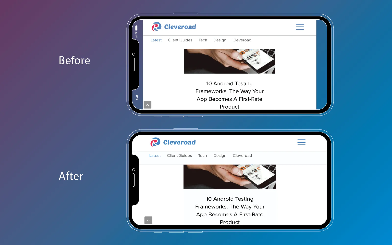
Designing for the iPhone X: Websites
9. Avoid using system-like gestures
As you know, screen of the iPhone X has no button that means all manipulations are done by gestures. Respectively, all the functions of the button were transformed into gestures. This fact may be confusing since we also use gestures when building interfaces. In turn, it may puzzle some users.
To avoid such situation, Apple offers not to hide the home indicator from iPhone X screen without necessity. Besides, the company warns us to be careful when working on interactive elements that placed closely to the home indicator. In case, there is nothing you can do with closely placed elements -- you can take the advantage of the edge protect feature that puts the priority of gestures. This way, the first swipe will be perceived as the app's gesture, while the second one as the system-level action.
As you see, there are lots of details you should take into account when designing for the iPhone X. Subscribe to our newsletters by filling the form you see at the right or at the end of the page if you're browsing on a smartphone and you'll get more exciting articles every week.
If you want to hire professionals to help you in creating your product -- contact our managers to get free consultation and answers to your questions.

Evgeniy Altynpara is a CTO and member of the Forbes Councils’ community of tech professionals. He is an expert in software development and technological entrepreneurship and has 10+years of experience in digital transformation consulting in Healthcare, FinTech, Supply Chain and Logistics
Give us your impressions about this article
Give us your impressions about this article