How Do We Select Fonts for Your Project?
Updated 18 Aug 2023
7 Min
3029 Views
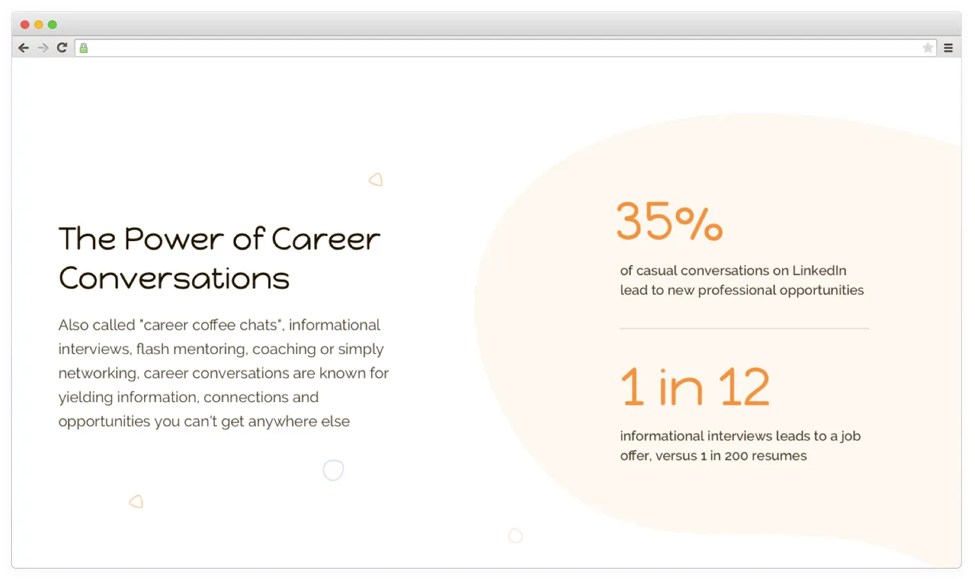
Typography is one of the most important tools helping to create an effective User Interface and capture users’ attention. The right typography makes it clear for users what your product is all about — entertainment, fashion, sports, or business. The right font can also increase your brand awareness.
User experience also depends on typography. Although most users aren’t aware of the basic typography rules, they can still feel that fonts don’t match with the UI or app’s theme. For example, a funny typeface used for a business website can lead to less trust from customers.
Would you like to learn more about the UI/UX design process? We’ve covered this topic in our [related article].
UI/UX design services at Cleveroad cover typography. Designers select fonts with the right emotional message (strict, playful, business) based on topic, context, and potential target audience. Besides, we pick appropriate font settings and placement to ensure good perception of information and highlight main points.
Psychology Behind Fonts
Each font evokes different associations. Let’s figure out several main types of fonts evoking similar feelings for users.
Straight and Elongated Fonts
This type can be a versatile option for many companies regardless of products or services they offer. Here are several fonts of this family:
- Open Sans
- Sans Serif
- Arial
- Helvetica
- Univers
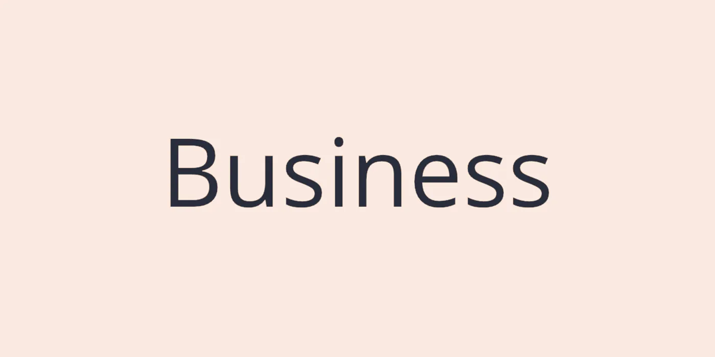
Example of a straight and elongated font
It’s a good fit for media projects and serious business services. These fonts won’t distract users from the content yet convey the mood of your product in the right way.
But they aren’t that good for advertising some original products. For that matter, it’s better to pay attention to non-standard fonts. It’ll help you stand out from competitors and make customers remember your campaign.
Strict Square Fonts
This group of fonts has massive and strict shapes. It’s typically associated with posters of manufactured goods or technological products. Some representatives of this fonts are:
- Sarpanch
- Michroma
- Saira
- Russo One
- Orbitron
- Exo
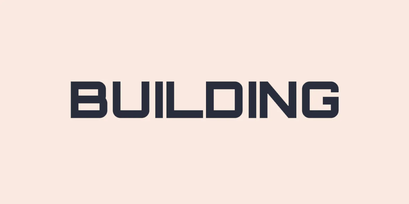
Example of a strict square font Orbitron
Rounded Fonts
A rounded shape of letters brings customers a feeling of comfort. Customers see a sign of care and kindness in these fonts. At the same time, square-shaped fonts seem strict compared to them.
- Nunito Sans
- Muli
- Montserrat
- Nanum Gothic
Example of a rounded font Montserrat
Italic Fonts With Vignettes
This group of fonts is known for lightness and beauty. It’s often used for advertising campaigns targeted at female audiences.
Italics makes it easier for users to perceive the information, but the overall appearance won’t let users feel that it’s something extremely important. That’s the reason why italics is used for footnotes.
Example of an italic font with vignettes Sign Painter
Cursive Fonts
The height and shape of these fonts make them less readable and easy to understand. Companies often use fonts from this group to highlight the exclusivity and originality of promoted products or services. They can also be seen on ads connected with legal services.
Cursive fonts are designed to point out the reliability of information and inspire confidence.
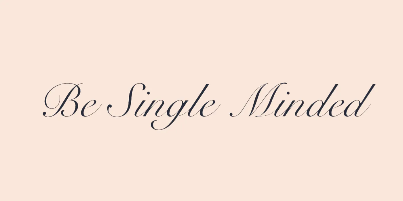
Example of a cursive font Snell Roundhand
Fancy Fonts
These are typefaces that look like graffiti, gothic lettering, or have other fancy styles. They should only be used when it’s essential to highlight certain characteristics of a product.
For example, it’s a bad idea to use such fonts for advertising a hair salon or toy store. Still, they’d look pretty good on a signboard of a thematic bar or a restaurant.
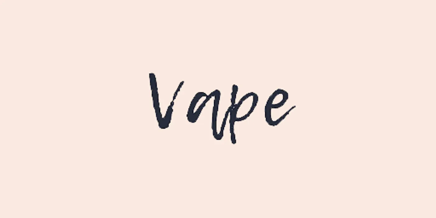
Example of a fancy font Lemon Tuesday
Font Combinations: Why Pick More Than One?
It’s often the case that styled fonts aren’t legible in smaller sizes. Yet they fit perfectly to the overall mood of the product ensuring its identity and originality.
In this case, our design team gets to selecting secondary fonts that are more readable and simple. Each font in this combination should complement each other and look balanced.
Learn about other design techniques we use. Here’s all you need to know about concepts in design.
Successful font combinations can be achieved thanks to their similar appearance or complete difference. The latter is also known as contrast in size, saturation, color, style.
Using too many styles and fonts in one User Interface is rather a bad idea. Users may lose the point in this diversity and won’t know where to focus their attention. It’s a generally accepted practice to keep the number of fonts within 2 or 3 for one product. It’s more than enough to emphasize important information.
On the image below you can see a website design for Open Studios. It’s a sewing studio where we’ve used a font with condensed width (Oswald Light) for drawing more attention. This font also looks very natural for this business.
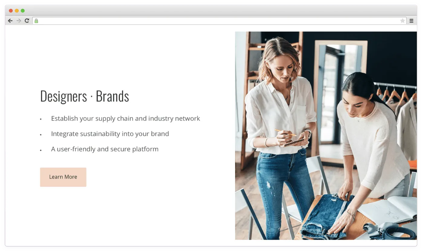
How companies use several fonts for design
Still, it’s poorly readable in smaller sizes due to high density. Letters merge making it a struggle for users to read the text. That’s why we’ve picked a complimentary, rounded font (Open Sans) to make smaller texts readable. However, some letters resemble letters from the font used for headlines. That’s how they complement each other.
This way, titles are clearly visible thanks to the size, color, style and they also match with the main texts.
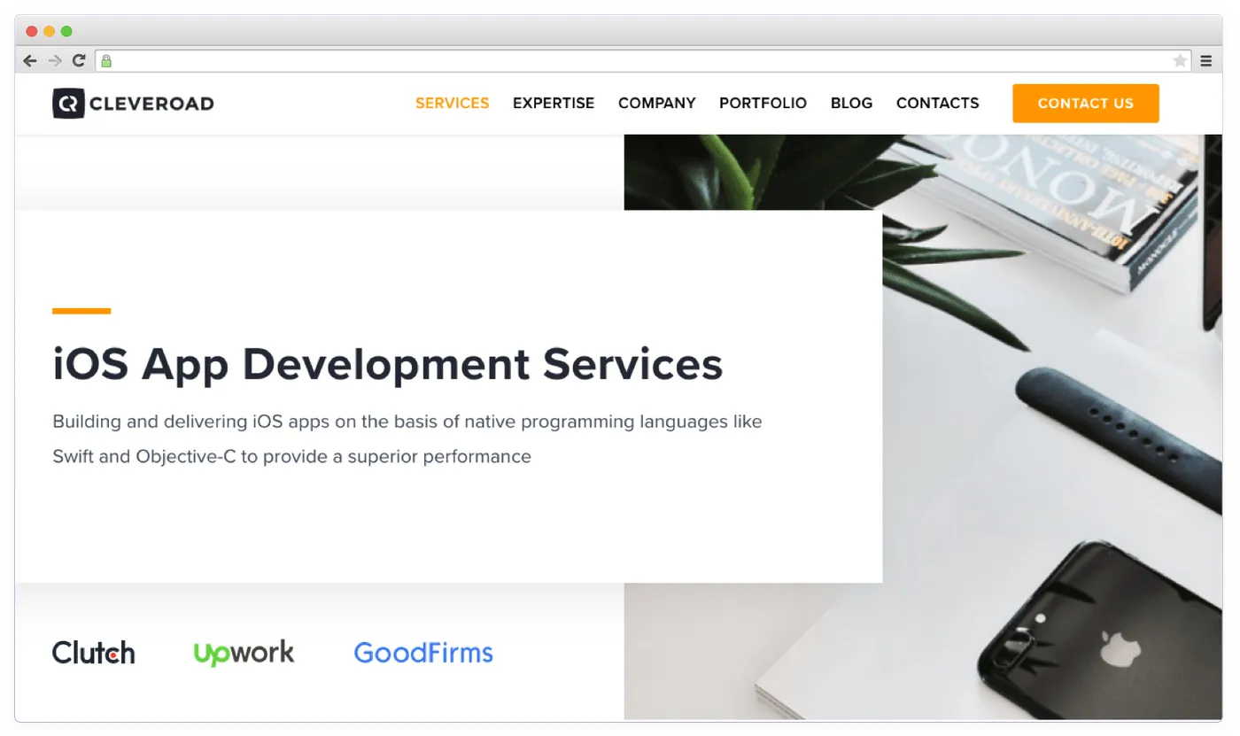
Another example is about our website — Cleveroad. Here, we’ve used fonts from one family (Proxima nova) for both headlines and main texts. Consistency and distinctive accents bring stability, peace and reliability to this design.
Example of a font combination
On the website below we can see playful headings (Happy Monkey), which is quite appropriate since the information is shown in the form of infographics with illustrations. But the main text has a stricter typeface (Raleway). If this font was used for the main text too, the whole website would look like a comic book.
Contrast between fonts for headings and main text
Fonts that are too different can lead to a visual disbalance working against the overall product design. However, too similar fonts will contradict each other.
Why Do We Use the Text Styles?
Font isn’t the only thing that affects how users perceive texts. Here are some of the factors having a huge impact on it:
- Size
- Type (italics, bold, regular)
- Letter spacing
- Paragraph formatting
- Structure of information
- Color
- Visual hierarchy
To come up with the right text style, designers should define the hierarchy. It focuses on organization of the content by splitting it into the following types:
- Headings
- Subheadings
- Main text
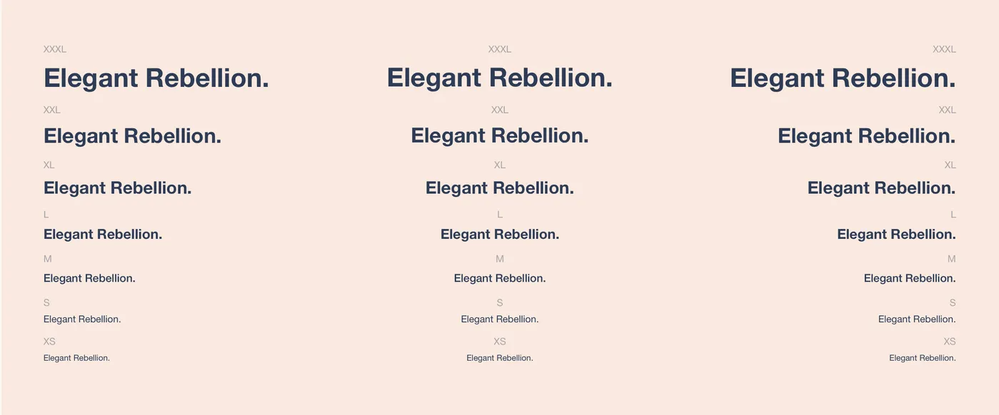
Text styling example
All these types should differ from each other. To focus users’ attention on the main thought, they shouldn’t have any doubts if the text is primary or secondary.
Next, the designer is working on stylistic elements which can be used in texts:
- Bulleted list
- Numbered list
- Quotations
- Notes
- Text split in columns
- Image annotation
- Highlights
- Pictograms
- Sections
- Links
- Indentation (between sections, heading and text, paragraphs)
- Underline
These and many other stylistic elements can be in handy for text formatting. It’s important to set a role for each format and make sure they don’t overlap.
Wrapping Up
So, the main task of the designer is to pick a font with the right emotional message matching your business. Then, it’s important to set some ground rules for using that font and work out all possible cases of its use on a website or an app. It’ll lead to a better perception by end-users.

Evgeniy Altynpara is a CTO and member of the Forbes Councils’ community of tech professionals. He is an expert in software development and technological entrepreneurship and has 10+years of experience in digital transformation consulting in Healthcare, FinTech, Supply Chain and Logistics
Give us your impressions about this article
Give us your impressions about this article
Comments
1 commentsSome great insights on fonts, thanks!