Flat Design vs. Material Design: How Different They Are
Updated 23 Jun 2023
11 Min
22081 Views
I hope no one here will be offended if I say that the difference between flat and material design is slightly visible (don't tell designers Im doing so). Indeed, a person who has a little knowledge of the subject may find them very alike. So Im going to fix this problem right away by shedding some light on the distinctions of both design approaches. Thus, you will be able to show off your expertise at every opportunity and will never ever hurt tender feelings of any designer in the world. So lets get to work!
A bit of history
Before we start our long debate on the differences between the two design styles, I think it would be quite reasonable to find out where they both have their roots in. Many believe that material design is based on it's flat fellow. But how did we come to flatness? Here is the legend
Skeuomorphism
In terms of UI and web design, skeuomorphism is the approach which is meant to imitate the physical world objects. Not to go deep into detail, just try to recall Apples old interfaces with their realistic textures, luminosity, and ostentatious effects (here is the figure if you are experiencing some problems with it).
iOS Skeuomorphism
To be honest, this try to make things resemble their real world counterparts was intended to facilitate the user-device interaction in the digital environment. Thats actually why all these rich-texture surfaces and life-like controls were dominating the world of IT for years people just needed to survive this migration from real to digital somehow. And it seems that skeuomorphic design style has been doing it's job well.
However, with the rise of mobile technologies, the world decides that it's time to move forward and focus on usability first. (Because, lets agree, this sphere is in need of app development service accessible across different devices.) So thats where simplicity begins as a new design standard.
Comparison of skeuomorphism and flat design
Remark! Don't think that skeuomorphism is completely dead. It's still widely used in games, where it's just needed badly to make people feel characters and immerse in the process.
Flat design
This is a type of design which is stripped of any multidimensional elements. Thats to say, it makes it feel like all the objects here are lying on a single surface. Flat design just got rid of any stylistic elements like drop shadows, textures, and gradients to be more like the play of fonts, icons, and colors. But why do we need this move? Thats pretty easy.
First of all, flat design reduces the loading time of a page greatly. The absence of heavy skeuomorphic details (think layers, gradients, serif fonts) makes flat design elements much smaller, which, in part, speeds up the load time. Whats more, flat elements may look equally attractive on both high-resolution and low-resolution screens (this is exactly what I meant by a strong mobile-friendly solution).
Second, simple images deliver your message more quickly than detailed illustrations. They are schematic, they are pretty naive, so everyone can get them.
Finally, flat icons with equally simple fonts accompanying them can help you direct users attention towards a really valuable content. Thus, people are not likely to spend much time on examining your digital art rather than reading text on your website or application. Although, these flat images may look quite nice to decorate your page and help users navigate through the web, mobile or desktop application.
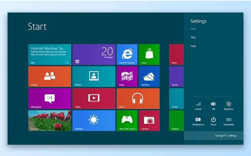
However great flat design may feel now, it caused some issues in the very beginning. The best and most obvious example I can give you so far is the release of Windows 8 by Microsoft, which is considered to be the pioneer of flat design, supporting the concept of Metro design. The main mistake of the company was to concentrate more on typography than on graphics.
In the Windows 8 usability test carried out by the NN Group, the results showed that users had difficulty in distinguishing actionable objects from non-actionable ones on the OS interface. Users complained that clickable objects had looked more like logos, which made people confused almost immediately. As a result, they failed to perform some of the request made by the testing company. So it meant that Microsoft, in turn, failed to accomplish the mission help users interpret the system and attract clicks.
Metro design
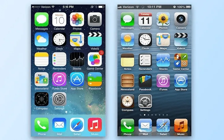
Another company that is usually associated with flat design is Apple. They moved away from skeuomorphic design elements with the release of iOS 7 dating back to the middle of 2013. And it seems that their move in this direction was accepted a bit better. Mainly because the company didnt try to integrate the entirely new concept of UI and just added a dash of flatness to the existing one. It gave users an opportunity to use the product relying on their previous knowledge of the OS and web.
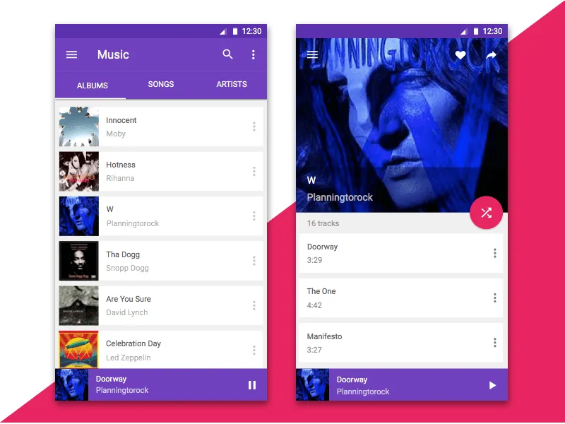
Material design
So material design, eventually
Lets dot the is and cross the ts right here and right now: material design is rather a branded product than a spontaneously born design style which became a bandwagon. This is actually what is considered to be the main difference between these two.
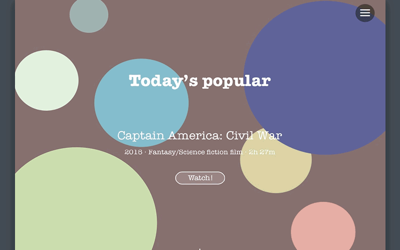
Cleveroad material design concapt
What I mean when calling material design branded is that it has a set of well-defined guidelines and principles every self-respectful mobile designer has to stick to (however, Google isn't after them to do things right the way they are in the instruction). The reason why Google introduced it's material design seems rather obvious: the need to make things look same on numerous Android devices. But what is the main idea of material design? Let's find out
Being functional to some extent, flat design is still thought to be a less intuitive type of design, though. The truth is, the excessive flatness of the objects on the screen can get users all mixed up (especially, if it comes to those of us who are not used to web or mobile interfaces). As I said earlier, clickable elements could be easily confused with non-clickable icons and texts, which may result in a much poorer user experience. So material design tries to introduce some skeuomorphism back nevertheless, it does it in the most simplified fashion possible. It can look really flat (especially, when it comes to colors), but stays multidimensional thanks to the Z-axis approach which is always taken into consideration.
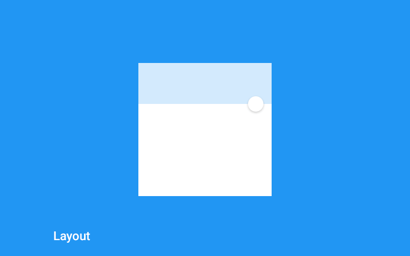
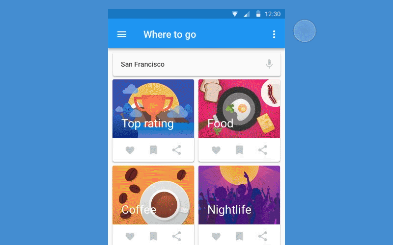
Material design by Google
In other words, material design is an improved version of flat design which lays stress on minor skeuomorphic details such as animations, shades, and layers. This, in turn, makes a product feel more intuitive, when it comes to navigation, and allows it to stay faithful to simplicity, when it comes to general style.
Advantages and disadvantages of flat design
Having left behind our long history of the designs evolution, lets finally form all the abovesaid into something brief and demonstrative. I guess we will start out with the flat design pros and cons at this point.
Pros
- Minimalistic and stylish.
- Easily understandable. That is, your idea will be delivered to the masses better.
- Time- and resource-saving. Pages are loaded faster, bandwidth is consumed less.
- Focused on a content. No overly detailed UI elements which can distract users from really valuable things.
- Looks equally great on different devices, be it a PC or a smartphone browser, and makes pages responsive.
- Speeds up the process of website/application design by getting rid of unnecessary design strokes.
Flat design for website
Cons
- Can be too simple in some cases. If gone too far, flat design UIs can look very featureless and generic.
- Can be limiting when it comes to the usage of shapes, colors, and iconography.
- Not that intuitive. The users who lack experience interacting with web and mobile may find it difficult to understand the purpose of some of the flat design UI elements. Thats also true for some skilled folks. Thus, it can be inappropriate for complex web or mobile solutions.
- Ubiquitous. The truth is, it could be really hard to stand out with flat design sometimes.
Advantages and disadvantages of material design
And let's not forget about the flat design's opponent.
Pros
- Minimalistic and stylish as well.
- More intuitive. Material design is great both for experienced users and newbies.
- Moderately skeuomorphic. Makes everything look more real due to the usage of Z-axis (a unique Googles concept).
- Has a set of well-defined guidelines which are kept updated constantly. So you always can refer to them if you have any difficulty working on the project.
- Promotes animation for web solutions. It's useless to deny, people love action. Moreover, animation helps users grasp the UI better.
Material design concept by Cleveroad
Cons
- Owned by Google. So it will be kind of hard to improve something that youre not satisfied with without asking the proprietor.
- May take longer to implement than flat, because of Z-axis.
- Motion can be very energy-consuming.
- A constant adherence to the guidelines can negatively affect designers individual creativity.
Lets sum up
It's actually stupid to assert that one of these two has obvious advantages over the other because flat and material designs go too close. Both are trendy and both are stripped of the excessive realism. Material design was a response to a radical flat approach whereas flat was a reaction to heavy and overly realistic solutions. Material has just added what flat design was always running from a little bit of skeuomorphism. Anyway, one thing stays different about them: material design is a Googles patented product, flat design is a product of several design practices mixed together that strive for a total simplicity (primarily).
Though, it worth mentioning that flat design is not that flat already. It tries to learn from it's own mistakes and competitors success. To be honest, flat design has evolved considerably over these years, working it's way up from an absolute-flat style to a semi-flat one. Now, staying flat to a great extent, it uses layers and faint shadows to make objects feel a bit deeper than previously. So you and I are the happy contemporaries of flat design 2.0.
And finally, nothing hinders you from trying to combine these two aesthetics to create really great, functional, and user-friendly products. So draw inspiration from flat and material design gurus and get down to work. Feel free to contact us and we will gladly help you out with it.
Hm, I guess there is one more thing left uncovered... Don't forget to subscribe!
This is a type of design which is stripped of any multidimensional elements. Thats to say, it makes it feel like all the objects here are lying on a single surface. Flat design just got rid of any stylistic elements like drop shadows, textures, and gradients to be more like the play of fonts, icons, and colors.
Material design is rather a branded product than a spontaneously born design style which became a bandwagon. It has a set of well-defined guidelines and principles every self-respectful mobile designer has to stick to.
In other words, material design is an improved version of flat design which lays stress on minor skeuomorphic details such as animations, shades, and layers. This, in turn, makes a product feel more intuitive, when it comes to navigation, and allows it to stay faithful to simplicity, when it comes to general style.
Here's the list of material design's advantages:
- Minimalistic and stylish as well.
- More intuitive. Material design is great both for experienced users and newbies.
- Moderately skeuomorphic. Makes everything look more real due to the usage of Z-axis (a unique Googles concept).
- Has a set of well-defined guidelines which are kept updated constantly. So you always can refer to them if you have any difficulty working on the project.
- Promotes animation for web solutions. It's useless to deny, people love action. Moreover, animation helps users grasp the UI better.
Here's the list of flat design's advantages:
- Minimalistic and stylish.
- Easily understandable. That is, your idea will be delivered to the masses better.
- Time- and resource-saving. Pages are loaded faster, bandwidth is consumed less.
- Focused on a content. No overly detailed UI elements which can distract users from really valuable things.
- Looks equally great on different devices, be it a PC or a smartphone browser, and makes pages responsive.
- Speeds up the process of website/application design by getting rid of unnecessary design strokes.
Flat design is so popular because it's well-optimized. This type of design reduces the loading sped of the page. Even though flat design don't have additional elements like different fonts and gradients, it still looks attractive on both high and low-resolution screens.
Second, simple images deliver your message more quickly than detailed illustrations. They are schematic, they are pretty naive, so everyone can get them.
Finally, flat icons with equally simple fonts accompanying them can help you direct users attention towards a really valuable content.
While the flat design has fewer elements ad delivers great optimization, the material design offers more attention to details and supplies users with a ton of attractive components on the screen.
Still, it doesn't mean that flat design is worse than material. In the right hands, both of these approaches can be used to create outstanding software.

Evgeniy Altynpara is a CTO and member of the Forbes Councils’ community of tech professionals. He is an expert in software development and technological entrepreneurship and has 10+years of experience in digital transformation consulting in Healthcare, FinTech, Supply Chain and Logistics
Give us your impressions about this article
Give us your impressions about this article