Tips On Creating Efficient Responsive Design: When A Responsive Website Prevails
Updated 08 Nov 2022
13 Min
4295 Views
What is the best way to attract new users to your product? To create a website and a mobile app, or website at least. Besides that, you shouldn't forget that today a large number of users will surf your website from mobile devices, not from desktop computers. That is why you need to think about a responsive design for your website to make a content good-looking on all portable devices. But when is responsive design applicable, and when a mobile app will be a better option? How to create a good responsive design properly? All answers you will find in our article.
Steps on how to create a responsive website
If you want to know how to design a responsive website, you should follow these simple steps:
- Step 1. Determine when you need to create a responsive web design
- Step 2. Consider technical pitfalls when you plan to make a responsive website
- Step 3. Add a proper content to your responsive website
- Step 4. Start the designing process
- Step 5. Pay attention to typography
- Step 6. Keep a mobile screen in mind
- Step 7. Verify how your design works with different browsers
- Step 8. Development process is initiated
When does your website need (or needn't) a responsive design?
First, even if you already have a responsive design and you know how to build a responsive website, you cannot claim that you don't need an app. It is necessary to determine whether an app will enhance your website and attract more new users, or it will become a waste of money. Everything you need is to understand what you can give your end users.
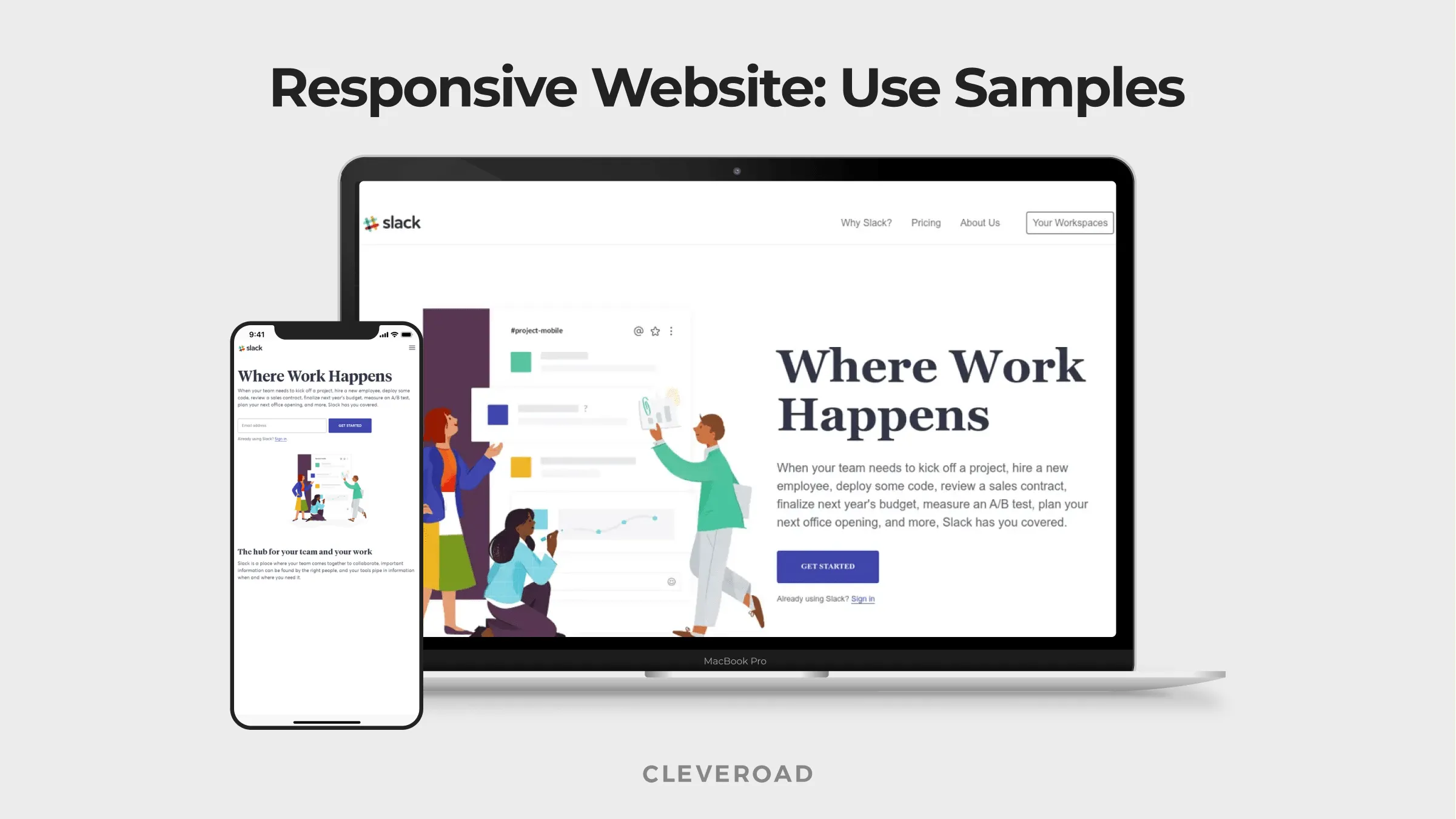
Sample of responsive web design
See what website type you should choose. Read Responsive web design vs adaptive web design. How to make your choice?
However, if you just intend to create a website, you should think about whether it is worth developing a responsive web design or make a non-responsive web design for a start. It depends on a goal you want to pursue. Let's find out when you need a mobile app, and check out benefits of responsive web design as well.
When mobile app is the option
A mobile app can better than a responsive website in the following cases:
Special opportunities
You plan to provide users with some specific services, and the app can turn this idea into reality in a full way. And your app icon on users' phone will help them remind about your product, so brand visibility is in action.
24/7 access
It can be achieved with the help of offline access, and the app only can give it to users. The website doesn't allow anybody to use it without the Internet connection.
Mobile app is an add-on
Website and app should have different purposes. For example, your website can be a description of your product and offer users advantages your product gives. But to use a specific service, they need to download a mobile app. Mobile version of a website and mobile app is a different thing. There is no sense to create an app that will contain the same information the website has. In this case, it is better to create a responsive web design. Importance of mobile-friendly websites is also very high.
Native functionality is used
Let's take Instagram app as an example. This app has a web version, but it's target audience uses a mobile app specifically. Why? Because mobile Instagram app makes use of phone camera, geolocation, and it also provides users with a quick access. Given the above, if your product requires using native functionality of mobile devices like contacts, camera or GPS, then a mobile app is what you really need, and it can bring more profit than creating a responsive web design for one website.
Game or online store
When you already have a website of such type, you can keep on building a responsive website as well, since people can use it from mobile. But to keep all elements of your product active and functional, you need to have a mobile app.
What about a design for a mobile app? Watch the video below to learn more:
Mobile App Design: How much does it cost?
Moreover, to handle a large amount of important data, a mobile app can be beneficial. For example, if it is an app for investments or some calculations, then users of a mobile version of a website will not get a full benefit.
When responsive web design is enough
Why you need responsive web design? As you understand, an app should be an integral addition to your website. Otherwise, you will not get any profit from it, so responsive web design will be exactly what you need.
When is it better to create a responsive website in the first turn? In the following cases:
Brand promotion
For example, you plan to create a powerful app like Uber or Periscope, but your app is new and nobody knows about it yet. Then a website with responsive design will be a good option to start promoting your new brand and allow people to get acquainted with it. Then, if everything goes well, you will be able to order a mobile app development. Many famous app owners have web versions of their product, but their main goal is to let people make use of their app. Our company can help you build a responsive website from scratch.
Specific content
Some websites simply don't need an app since users can make use of it as much as possible. It can be news website or e-mail services, or website with food recipes. Of course, large e-mail services like Gmail or Yahoo have mobile clients, but everything depends on a size of an audience and your end target.
Discover more about GDPR and why you should follow it. Read GDPR 2024: important EU directives for business owners to comply with.
Anyway, if you are not sure whether you need a responsive website or mobile app, or both of them, we can give you a piece of advice, and our developers are experienced in the development of mobile apps and websites of all levels of complexity. And if you think a responsive website is your choice, we will proceed to the basic tips on how to make responsive website design. It will help you avoid main mistakes and learn more deeply how responsive design works.
Technical pitfalls to consider
Before we describe the process of responsive design building, we should describe main challenges web developers should avoid when they create responsive web design services.
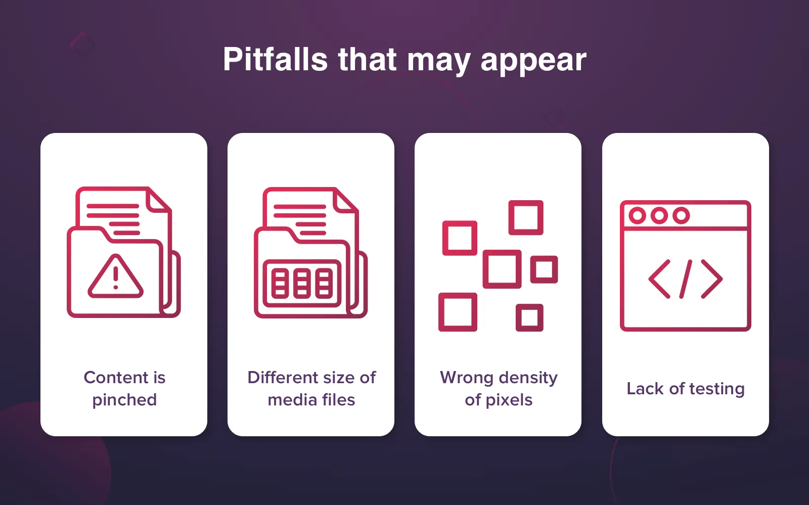
Important issues to consider when creating responsive design
Content
Here developers need to become a user for a while. They need to understand what people want to see when they use a mobile version of the website. What elements should be hidden and how others will look on different devices - smartphones and tablets.
Size of media files
Developers shouldn't forget about large images and videos a website can contain. Of course, the scale of all media files can be decreased to make it visible on mobile devices, but due to the large size of these files loading process can be longer and more irritating. That is why it's an item developers should consider when they create responsive web design from scratch.
A density of pixels
This issue refers to an issue above partially. A good website should have a content that will look perfect both on large PC and on a small smartphone. It is a pitfall that unskilled developer may face.
Testing
Developers should test a website on as many mobile devices as possible. Today it is possible to do on special desktop emulators that mimic various mobile devices. Moreover, an experienced and large development team may have physical testing devices available. At Cleveroad we have a wide range of devices to make sure that everything works properly both on tablet and on a smartphone.
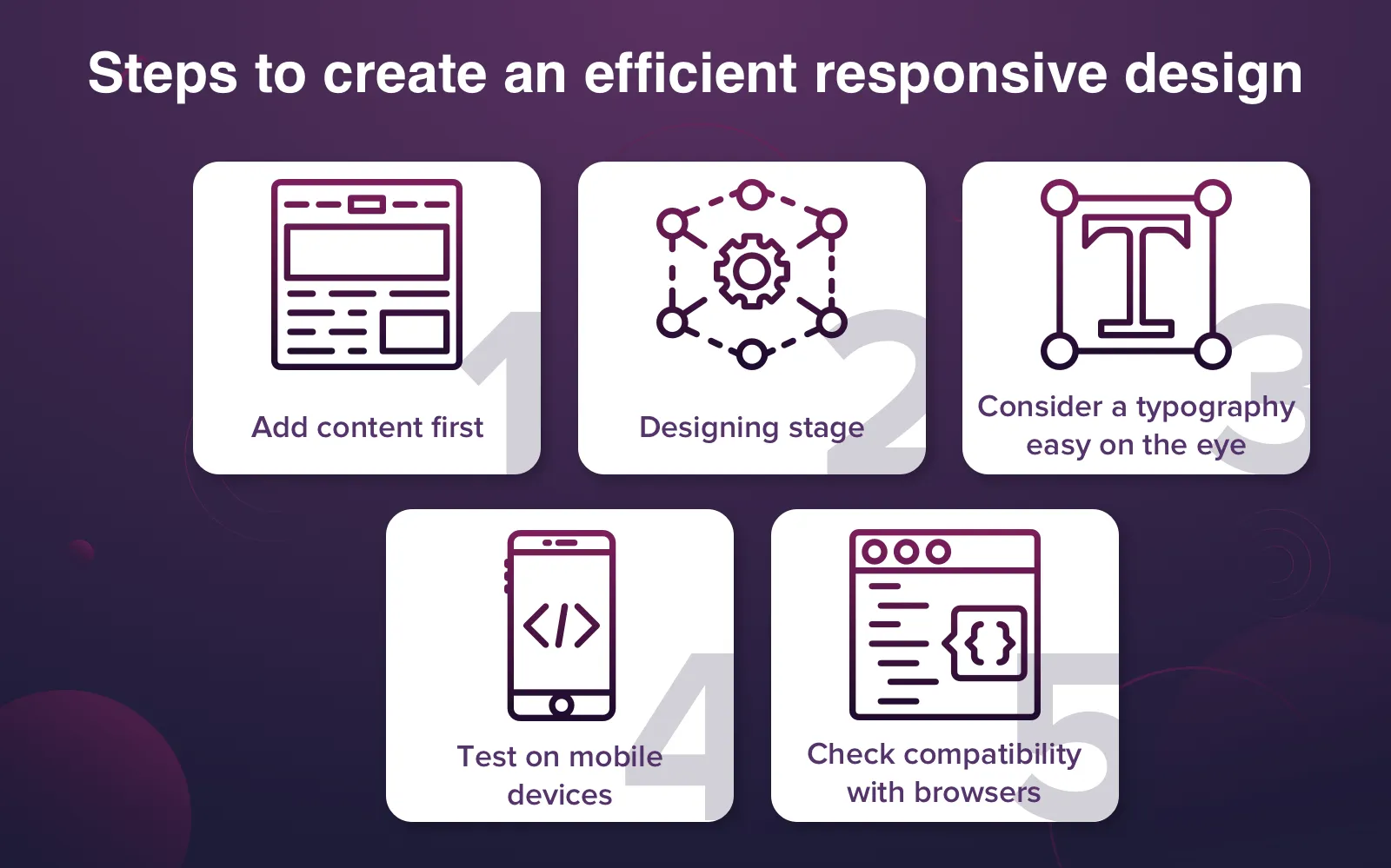
Important steps we take to create a good responsive web design
Now let's study all responsive design development process step by step to understand how to create responsive website efficiently and make it look awesome.
Step 1. Content comes first
The first step all web designers should take is to think about a content. Yes, it is not a mistake, content should be elaborated first and that is what makes a good responsive website. Usually, web designers create a web page, and only upon the development web page design, they ask a content writer to fill this page with an appropriate content.
As a result, it may lead to discrepancies in the web page and some failures in a proper displaying of elements on the page. So it is necessary to follow the scheme below according to responsive web design principles:
- A writer creates a content for web designer;
- Then designer should find appropriate images and logos;
- A designer should make sketches of a future website in a text document and show how he sees text, buttons, and images;
- The development team can make any changes in this doc until everyone is satisfied;
- Start the designing!
Following this simple scheme, the final result will be worthy.
Step 2. Designing
When all content issues are resolved, designers can proceed to the process of designing for responsive web design. Now designing can be performed considering particularities of the future content. It will help designers create right mockups.
Find out how to design an attractive iOS app. Read Designing for iPhone X: 9 tips to create a great-looking app
Our designers can use templates from different graphics editors or they can design it manually from scratch - it will depend on specific requirements of each customer.
Important things to consider
When designer took two steps indicated above, they have to focus on a few small steps that are important nevertheless. Considering all of them, web designers will be able to provide a customer with a good product and all advantages of responsive web design.
Step 3. Typography means a lot
Some web designers can pay more attention to UX of a website and general decor, but it is a wrong approach. First, designers should take fonts and navigation into account since even if the website looks awesome, it will not increase more trust from future visitors when fonts look rambling.
That is why designers should pay attention to typography first. Designers should use specific tools that assist in the development of appropriate fonts. Special tools for analyzing typography will help avoid problems in future. That is what you need to know when you find out how to develop responsive web design.
Step 4. Keep a mobile screen in mind
The designing stage is always performed on a desktop computer and, when we create a responsive website, we can see how your website will look on a computer screen. But as it is a responsive version, you cannot forget about a mobile screen, it is necessary to verify how your website looks on mobile screen even if everything seems ideal on a computer. Are images great-looking and compressed as necessary? Having tested your website on different mobile screens like tablets and smartphones, we are able to prevent some possible problems in future like bug fixes.
Step 5. How design works with different browsers
Apart from good displaying of your website on mobile devices and desktop, we cannot ignore different browsers. The difference in browsers can also have an impact on how your website will be displayed, so we always test design on all important and big browsers.
Steps that make a good responsive design
Development stage
If everything mentioned above meets necessary requirements, we can proceed to the development stage. Front-end developer should have a high-quality mockup of the website where required text and images should already be contained. At Cleveroad, designer and developer keep communication during all the development process to consider all important details and not to miss something critical. As a result, we can provide the customer with a first-rate product.
What about time and cost?
On the whole, the cost of responsive design development is higher than the development of an adaptive website. It is related to a larger number of resources spent on the development and more development time. What benefits of responsive website design? A responsive website makes it possible to give you a product that fits all devices well. One website - all devices. But anyway development of one website is cheaper than the development of two separate sites by default.
How much time and money can the development of responsive design take?
#1. If we take our experience as an example, the process of responsive web design making is the reason for the development cost and time growth. Responsive web design development requires 30-50% of the additional time in comparison with the time spent on building adaptive web design. As an example, one of our last projects required 300 hours for making responsive design only. Based on this, it took about $10,500 to create a web design.
#2. The testing process of responsive web design is longer for 30-40% as well. For example, it takes 100 hours to test an adaptive design. Responsive design testing requires +30-40 hours of testing additionally, thus, it increases the development cost for $1050 - $1750. It is connected with the testing on 6 different resolutions - for each type of screen (mobile, laptop, PC, tablet etc.)
Adaptive and responsive design - which one is advantageous? Our video will explain to you what is better:
Responsive vs Adaptive Design: Which's Best for You?
However, despite it's higher cost, responsive design is more popular since it gives more opportunities to owners. Moreover, responsive websites are beneficial for SEO since they have only one URL, and Google prefers responsive design in websites. So it means everybody will be able to find your website faster.
Learn why continuous integration can be advantageous for customers. Read Benefits of continuous integration for customers
But if you need an additional mobile app to your website, we can always be at your disposal. Contact us and give us a task - we will fulfill it. If you still didn't get acquainted with our other capabilities, read our blog - to get all articles first click on Subscribe button you see on the right side.
Responsive web design stands for creating of websites that can make dynamic changes to the appearance of a website, depending on the screen size.
If you want to know how to design a responsive website, you should follow these simple steps:
- Step 1. Determine when you need to create a responsive web design
- Step 2. Consider technical pitfalls when you plan to make a responsive website
- Step 3. Add a proper content to your responsive website
- Step 4. Start the designing process
- Step 5. Pay attention to typography
- Step 6. Keep a mobile screen in mind
- Step 7. Verify how your design works with different browsers
- Step 8. Development process is initiated
Let's study all responsive design development process step by step to understand how to create responsive website efficiently and make it look awesome.
- Step 1. Content creation
- Step 2. Designing
- Step 3. Picking right typography
- Step 4. Website testing on different mobile screens and desktop browsers
- Fluid grids. Fluid grids are based upon the sizing of page elements instead of using pixels.
- Media queries. This is the main method of gathering information about website visitors.
- Flexible images. The size of flexible images is dictated by relative units so they are kept inside of their element.
Content
Here developers need to become a user for a while. They need to understand what people want to see when they use a mobile version of the website. What elements should be hidden and how others will look on different devices - smartphones and tablets.
Size of media files
Developers shouldn't forget about large images and videos a website can contain. Of course, the scale of all media files can be decreased to make it visible on mobile devices, but due to the large size of these files loading process can be longer and more irritating. That is why it's an item developers should consider when they create responsive web design from scratch.
A density of pixels
This issue refers to an issue above partially. A good website should have a content that will look perfect both on large PC and on a small smartphone. It is a pitfall that unskilled developer may face.
Testing
Developers should test a website on as many mobile devices as possible. Today it is possible to do on special desktop emulators that mimic various mobile devices. Moreover, an experienced and large development team may have physical testing devices available. At Cleveroad we have a wide range of devices to make sure that everything works properly both on tablet and on a smartphone.
Responsive web design development requires 30-50% of the additional time in comparison with the time spent on building adaptive web design. As an example, one of our last projects required 300 hours for making responsive design only. Based on this, it took about $10,500 to create a web design.

Evgeniy Altynpara is a CTO and member of the Forbes Councils’ community of tech professionals. He is an expert in software development and technological entrepreneurship and has 10+years of experience in digital transformation consulting in Healthcare, FinTech, Supply Chain and Logistics
Give us your impressions about this article
Give us your impressions about this article