Healthcare Data Visualization: Transforming Insights Into Action
Updated 26 May 2026
17 Min
739 Views
Today, extracting valuable data from health systems is critical for healthcare providers to make informed decisions. However, this information can be challenging to interpret and communicate. This is where healthcare data visualization comes in. It allows you to transform complex data into intuitive visual representations, such as interactive dashboards, graphs, charts, etc. This easy-to-understand presentation of information helps improve clinical decision-making, patient care, efficiency, and more.
In this article, we will tell you about the concept of health data visualization, the main advantages, and pitfalls of this technology, and also give some examples and implementation details.
Data Visualization in Healthcare: What’s Fuss About?
Healthcare data visualization implies using visual representations such as charts, graphs, and interactive dashboards to understand complex healthcare data clearly. It involves converting large amounts of healthcare-related data into graphic formats that medical professionals, researchers, administrators, and patients can easily interpret and analyze.
How healthcare data visualization works
The importance of data visualization in healthcare implies improved decision-making and patient outcomes and facilitated data analysis process. By visualizing data, healthcare professionals can identify main patterns, trends, or correlations that may not be immediately apparent in raw data. This helps identify anomalies, track disease outbreaks, monitor patient conditions, and identify opportunities to improve healthcare processes.
Healthcare sources used for data visualization
Data visualization in healthcare is based on a variety of statistically sound and legally valid sources, including:
EHR and EMR solutions
Such systems contain patient data, including patient histories, treatment plans, physiological data collected by IoT devices, etc.
Want to create your own EHR solution? Read our guide to EHR software development
Data collection forms
Surveys allow the collection of a lot of statistical information about patients. Their visualization allow to analyze statistics and improve healthcare operations according to the results.
Remote monitoring systems and wearable devices
Wearable devices and remote patient monitoring systems collect many physical patient data, such as heart rate, blood sugar, oxygen levels, etc. These data can then be analyzed for treatment using health data visualization.
For data from these sources to be successfully used for medical data visualization, such requirements must be met:
- Sufficient amount of information. The more data fed into the system, the more complete the healthcare data visualization will be.
- Well-elaborated mathematical models. Clinical data visualization tools must have well-founded mathematical logic and algorithms. Furthermore, this mechanism must work flawlessly to convert medical data into accurate, comprehensive graphics.
- Quality software and interface. The software must be well-built and easy to use for clinical data visualization to be fast and efficient.
Healthcare Data Visualization Examples: Types of Visuals Used
Let's review some basic examples of clinical data visualization and the types of visual reports used:
Medical dashboard
The medical dashboard is a full-fledged health data visualization that includes important metrics and KPIs. It typically consists of various visual elements, such as graphs and interactive items, to monitor patient data, resource utilization, and clinical outcomes in real-time.
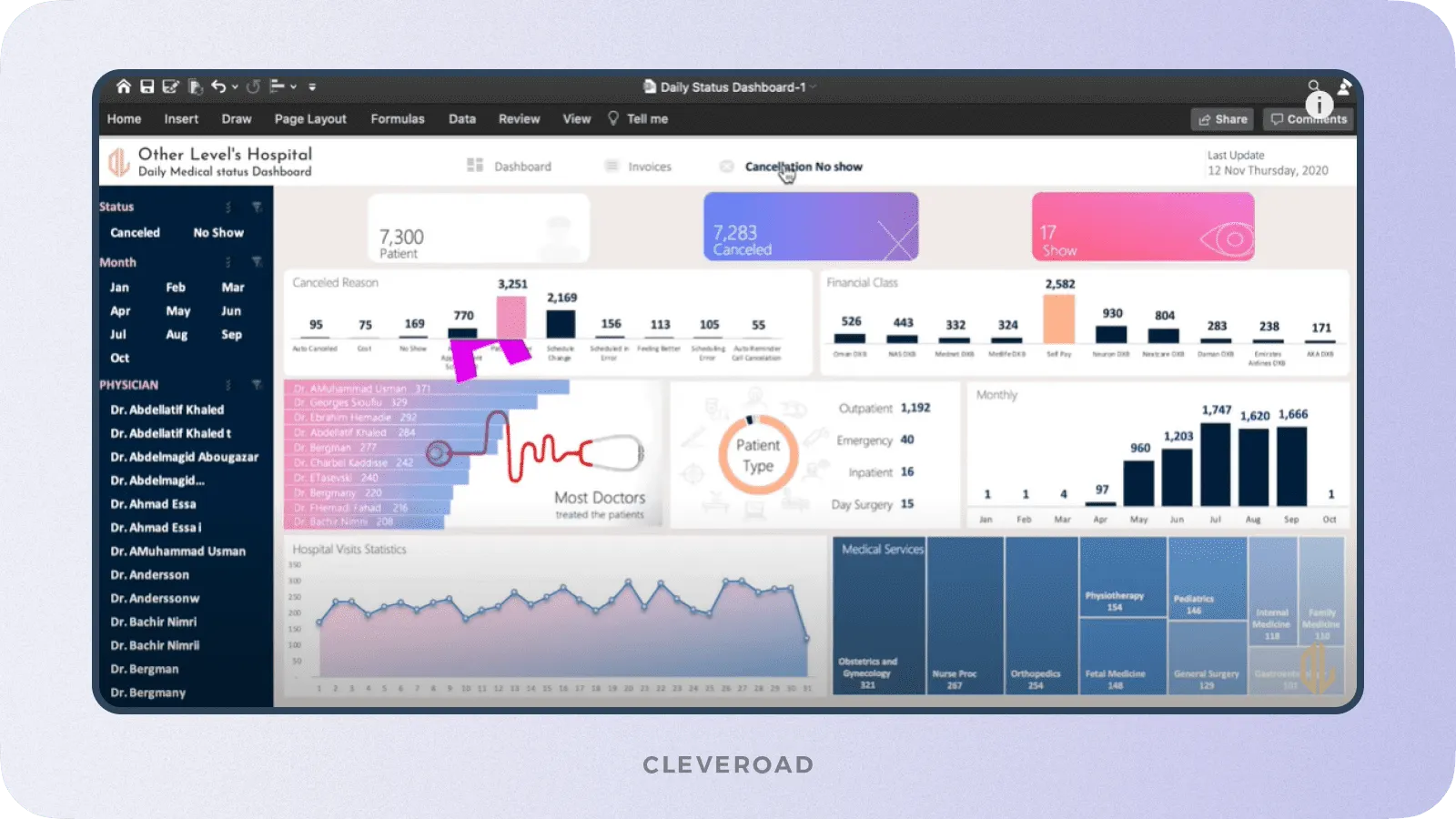
Medical data dashboard example (Source: Other Levels)
Interactive apps, sites, and widgets
These clinical data visualization tools are quite handy and provide users, such as physicians or patients, with information in a convenient way. In addition, interactive applications, websites, and widgets are commonly used to drill down into specific details and extract meaningful insights.
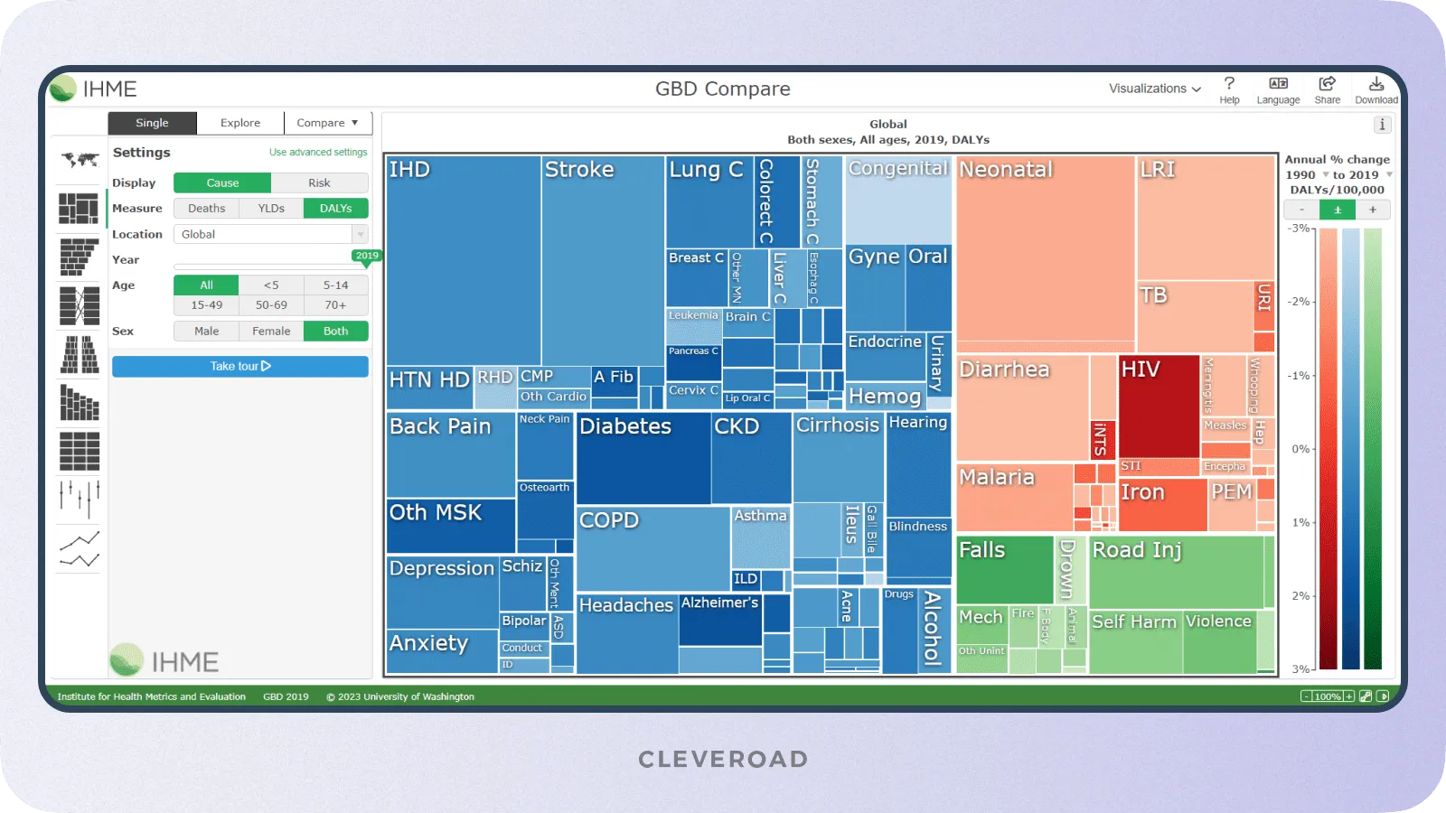
Healthcare data visualization website example (Source: VizHub)
Charts and graphs
Charts and graphs are the primary and most common elements of data visualization in healthcare. They allow large amounts of information to be structured and presented clearly and easily for further analysis. In addition, this type of visualization makes it easier to track trends, patterns, correlations among data, etc.
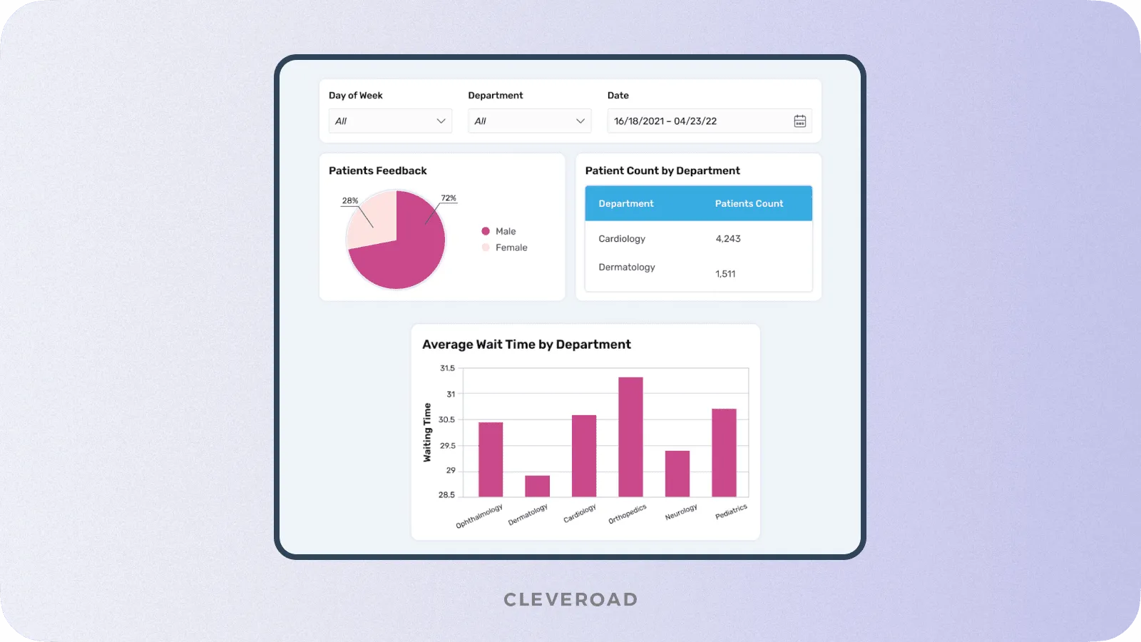
Medical data visualization: charts and graphs examples
Infographics
Infographics combine text, images, and graphics to present healthcare data in a visually appealing and easy-to-understand format. This type of medical data visualization allows you to unite as much information as possible and is often employed for training. Because of their brevity and clarity, infographics are also often used for public health information.
Medical infographics example (Source: Centers for Disease Control and Prevention)
3D volume rendering of a skeleton
3D volume rendering allows you to create a clear visual representation of the patient's skeleton. In addition, all the health data collected with medical devices will be displayed in the 3D model, facilitating the diagnosis process and further treatment planning.
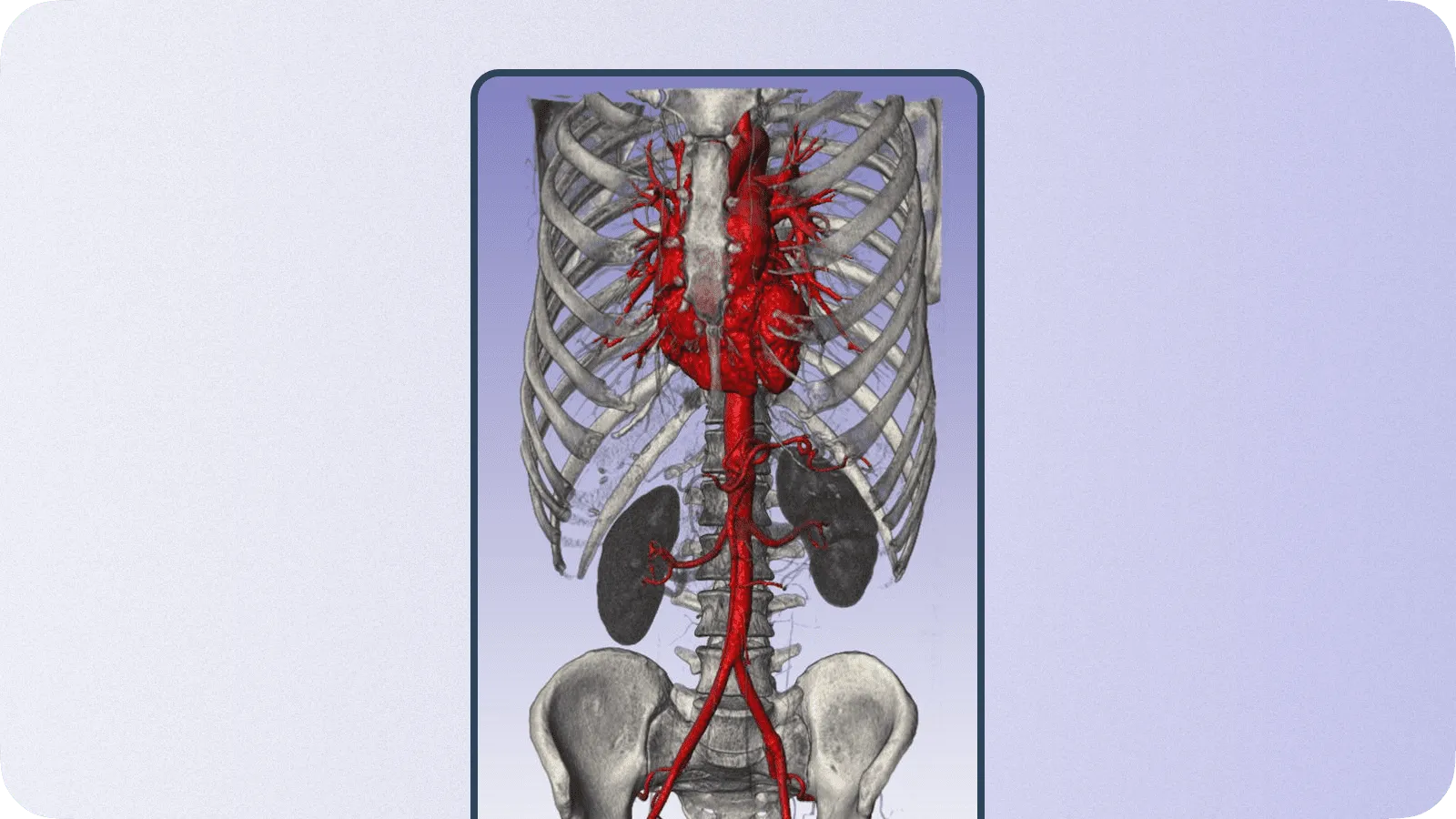
3D volume skeleton rendering example (Source: Simpleware)
Electrocardiogram (ECG)
An electrocardiogram allows to visualize data on the heart's electrical activity over time. This type of health data visualization is actively used in cardiology and enables physicians to draw conclusions about a patient's heart condition and create a treatment plan.
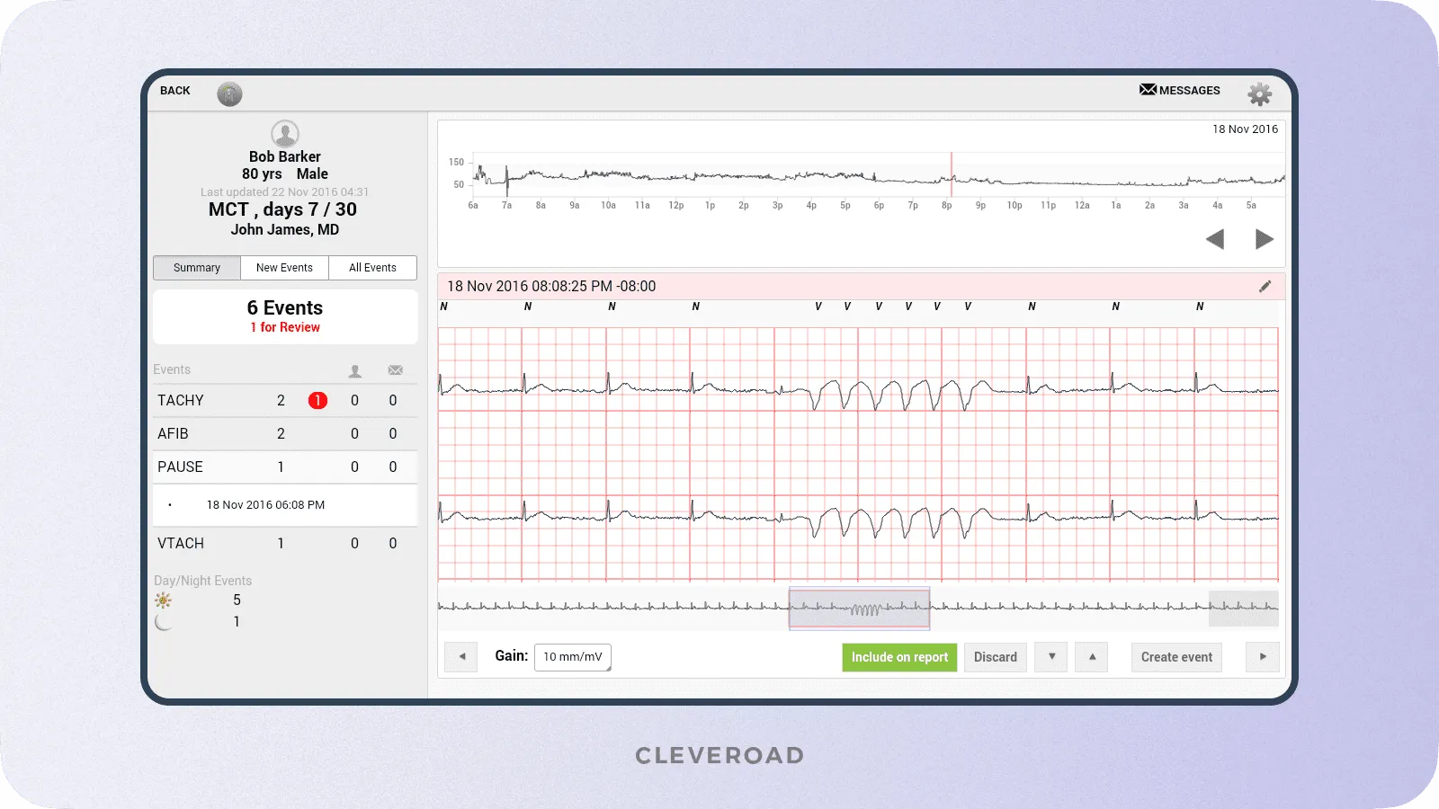
ELectrocardiogram (ECG) example (Source: Mobi Health News)
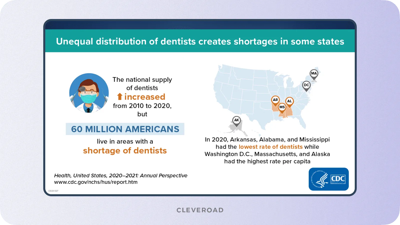
Heatmaps
Heatmaps are graphical representations of a particular area or the entire globe, on which colors indicate the intensity or density of a specific variable. Heatmaps can provide statistical information, such as disease prevalence, resource use, etc., in a concise and understandable form.
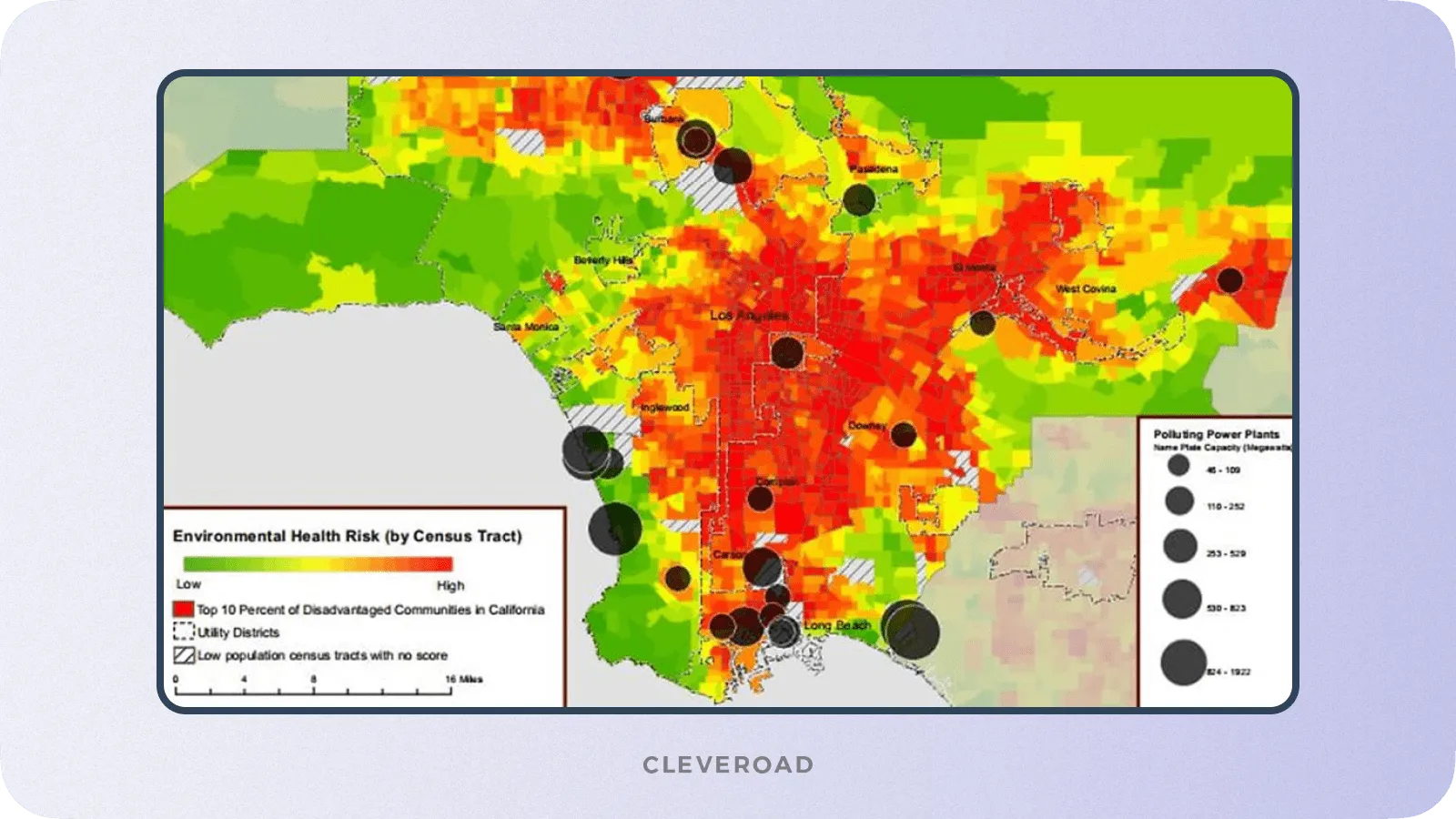
Geographical heatmap for health data visualization
Importance of Data Visualization in Healthcare for Better Decision-Making
Data visualization in healthcare has many benefits related to improved decision-making, quality of care, etc. The main advantages of medical data visualization include the following:
Improved perception of data
Data visualization simplifies the analysis of complex medical information by presenting it in clear graphs and charts. This allows medical professionals to identify patterns, trends, and outliers that may be missed in the raw data. This will give you valuable insights into patient populations, disease patterns, treatment outcomes, and resource utilization.
Better patient care
Healthcare providers can more effectively track patient satisfaction scores using clinical data visualization tools. By comparing metrics over time and performing detailed analysis, you can examine the reasons for these changes and provide better care.
Explore how to improve patient care with patient portal development
Professional visualization of medical device data
Any medtech device requires software that allows you to interpret data quickly and clearly. Medical data visualization enables healthcare professionals to scan patients, analyze data in charts and animated visualizations to determine patient health status and manage medical devices to improve visual detail and viewing angle for the best diagnostic quality.
By the way, at Cleveroad, we had experience creating an IoT-based telecare system for hydration monitoring. The solution allows for tracking hydration indicators received from the IoT sensor and creating training and care programs through the Admin panel.
Improved decision-making
Visualizing medical data provides informed decision-making. Healthcare professionals can quickly identify correlations, trends, and areas of concern or need for improvement, allowing them to make evidence-based decisions. For example, visualization can help identify high-risk patients, track disease outbreaks, efficiently allocate resources, and assess the impact of interventions.
Identifying trends and patterns
Visual representations can be used to identify and learn correlations between events and their consequences in medical practice. For example, it reveals changes in morbidity over time, analyzes the frequency of symptoms in different patient groups, and examines how contextual factors such as seasonality, gender, and socioeconomic status are related to healthcare outcomes. In addition, medical data visualization makes it easier to assess the impact of specific interventions, such as adopting new treatment protocols on patient conditions, treatment outcomes, and feedback.
Top-3 Data Visualization Tools in Healthcare
Let's take a brief overview of the healthcare data visualization tools available on the market that are the most popular and highly regarded among medical organizations:
Microsoft Power BI
Microsoft Power BI is a business intelligence platform that allows you to analyze real-time data and identify critical trends. Microsoft Power BI integrates with most Microsoft products and cloud services to create a single infrastructure. Also, the platform has robust security algorithms and allows you to create engaging immersive dashboards and reports. Microsoft Power BI has a mobile app and is easy to use, especially if you have experience with Excel. However, the platform has drawbacks such as heavy CPU usage and incompatibility with Mac desktops.
Tableau
Tableau is compelling and flexible data visualization and analysis platform. It allows users to build visualizations with drag and drop, use AI-driven statistical modeling, and ask questions using natural language. The main pluses of Tableau are informative dashboards, scalability, and integration with Slack. Nevertheless, the platform is one of the most expensive in its segment.
Qlik Sense
Qlik Sense is one of the most popular data visualization tools using AI. Qlik Sense provides deeper interactivity and broader context than other data visualization tools. It is also able to combine data from hundreds of sources. Qlik Sense is available as a Software-as-a-Service (SaaS) solution. However, the user interface requires improvements.
Despite the wide variety of ready-made solutions for data visualization in healthcare, you may find it challenging to choose the one that will satisfy all your needs. Regarding this, the most effective solution would be custom medical software development. It will allow you to avoid overpaying for unnecessary features and get unique functionality that meets the goals of your healthcare business.
Pitfalls You May Face in the Process of Visualizing Health Data
There are some complexities that can cause some difficulties in data visualization. Let's take a look at the most significant ones and find out how to deal with them:
Inefficient and useless data in the database
Excessive data in the database can worsen the results of clinical data visualization. It can lead to data quality issues, distort insights, increase complexity, and impact decision-making. Information management practices such as cleansing, standardization, and validation can help solve this issue. These measures will ensure data integrity before visualization. By keeping the database in order, you will achieve the best results.
Inaccurate interpretation of visualized data
Misinterpretation of visualized health data can also have negative consequences. Causes of inaccurate interpretation include:
- False or misleading representations
- Subjectivity in interpreting visualized data
- Lack of context
- The complexity of data
All of these can lead to misunderstandings and poor decision-making. It is critical to provide clear communication and proper context along with imaging, promote interdisciplinary collaboration and improve data literacy among healthcare professionals to address these issues. In addition, education and training on data interpretation and visualization can improve accuracy and encourage the effective use of visualized data for informed decision-making in healthcare.
Outdated healthcare software systems
Outdated software can also negatively impact data visualization for healthcare. The main challenges of older systems are compatibility issues, low security, and poor design. They can negatively impact the accuracy and precision of the information, impose certain restrictions on access to information, neglect the needs and expectations of the end-user, and present excessive or irrelevant information due to cognitive overload.
To solve this problem, a careful approach to development and design is necessary, considering end-user requirements, simplifying complex information, using appropriate visual encoding techniques, ensuring clarity and consistency, and conducting user testing and feedback iterations. Also, it'll be necessary to conduct a patient data migration, to clear and structurize data before relocating it into the new software. The easiest way to achieve satisfactory results is to turn to an experienced software provider specializing in legacy software modernization services.
Lack of tech expertise
The process of visualizing medical data requires a certain level of expertise in medical software development. Because of this, it may be difficult for you to find the necessary expertise in your city or even your country. Programming outsourcing comes to the rescue of this problem. It gives you access to talent and technology from around the globe, allowing you to choose the best among healthcare data visualization companies.
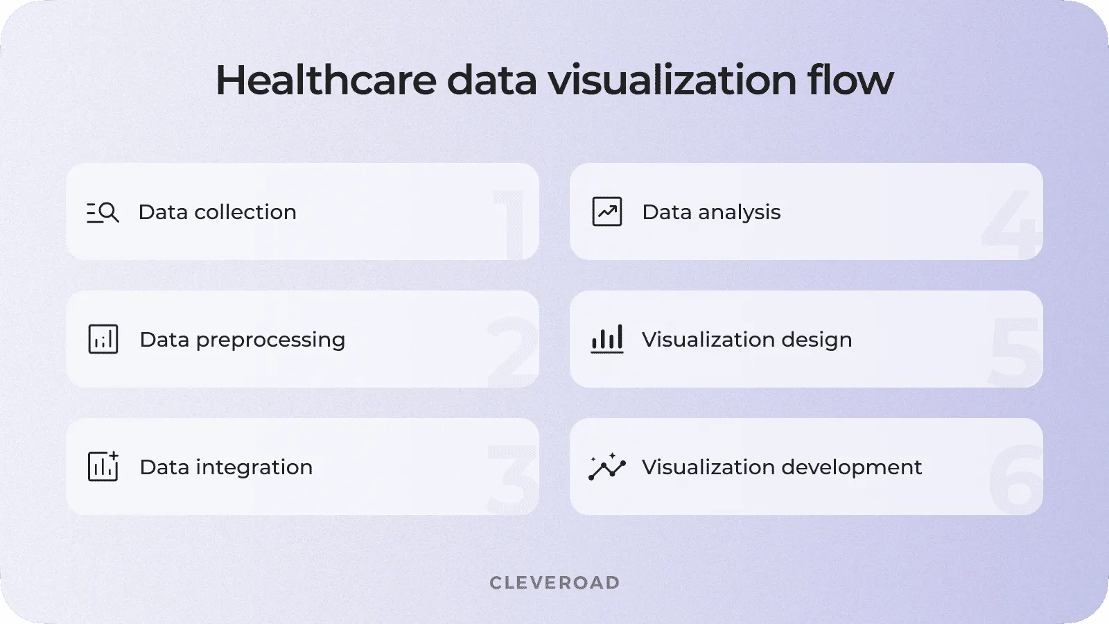
How to Implement Software for Actionable Clinical Data Visualization
Now, let's walk through the process of implementing data visualization tools in healthcare step by step.
1. Define the problem/area of use
First, you will need to determine the importance of clinical data visualization for your company. It is necessary to define your target audience (administration, doctors, or patients), the type of information that needs to be transformed, as well as the desired outputs.
2. Choose custom vs ready-made tool
Next, you need to decide whether to develop healthcare data visualization software from scratch or purchase a ready-made solution. To make the right choice, you should consider the following factors:
- Buying a ready-made solution may be cheaper, but custom development will pay off in the long run
- Development the solution from scratch will allow you to get only the most necessary features created according to your healthcare operations needs
- A custom solution can offer much more flexibility and adaptability, unlike the strictly limited scope of ready-made solutions
Thus, if you plan to achieve the best results with data visualization tools in healthcare, it is worth turning to custom development.
Learn more about custom telemedicine software development: benefits, cost, and solution demo
3. Decide standalone solution vs an integration
Another important decision is choosing a standalone solution or integrating healthcare data visualization into existing systems. In this case, it is worth taking into account what you have. For example, you already have modern EHRs, telemedicine applications, and other software. In that case, you can integrate them with a medical data visualization solution providing seamless data flow between systems.
4. Assess data quality and identify data resources
Next, identify sources for visualizing health and healthcare data, such as repositories, warehouses, or APIs. This information's quality, availability, and compatibility should also be assessed. An experienced IT company can help you with this step, as well as all of the previous ones.
5. Hire an IT partner
For successful development and implementation of data visualization in healthcare, you will need to work with an IT team with practical experience in telemedicine software development services. Such a tech provider will take on all the responsibilities of creating the software with data visualization and help you with all the preparatory steps. In this case, you can choose from three types of cooperation:
- Freelance. You can hire a freelancer to develop a module for data visualization in medicine for you. This cooperation model has the lowest price but the competence of one specialist may not be enough to create a complex healthcare solution. To implement such a complex solution, in addition to the developer, you will need to separately hire a designer and a QA specialist, which can take a lot of time. Moreover, several separate specialists will be challenging to control.
- In-house team. You can hire all the necessary specialists to work with you permanently. This will ensure that you have complete control over all processes. However, finding and recruiting the right experts in your area can be difficult and time-consuming, and keeping them can be expensive due to the high administrative costs.
- Outsourcing. This option will allow you to get a pre-screened team of specialists and reduce development costs by hiring globally. Moreover, the number of outsourcing companies today is quite impressive, and you will be able to find the right team among such a variety. The central aspect you should pay attention to when choosing is the availability of relevant expertise and experience in healthcare software development.
Cleveroad is one of the healthcare software development providers that can cover such projects end to end. Our team has been delivering HealthTech and telemedicine solutions since 2011, helping medical businesses build secure platforms, improve inherited systems, and prepare software for compliant remote care delivery.
A relevant example is DECODE.ME, a teledermatology platform created for Codex Labs, a Silicon Valley plant-biotechnology company. Codex Labs needed to prepare the platform for release, so Cleveroad reviewed the existing architecture and codebase, fixed critical defects, improved backend stability, and configured HIPAA-compliant infrastructure for protected online doctor-patient consultations.
Watch Barbara Paldus, Founder and CEO of Codex Labs, describe her experience with Cleveroad and share why she recommends our team as a trusted HealthTech software development partner.
6. Design, Development, and QA
After you contact your software provider team, they will help you detail the requirements and draw up a clear scope of work. Then, the design team will start working on the User Experience (UX) and User Interface (UI) for your software solution. The design is very important, as it must be user-friendly and easy to use. It is also necessary to detail the requirements for the visual elements resulting from the visualization and to work out all the essential aspects of the interface.
Next, the development team will start building your data visualization solution. The specialists will create the software based on the design specifications and implement a database structure that efficiently stores and manages the data needed for visualization. They will also integrate the software with the identified data sources, such as EHR systems, data warehouses, or external APIs, and ensure secure data connectivity and transmission.
After the software is ready, a team of QA engineers will run tests to identify and fix any possible bugs before the release and evaluate the developed solution's usability and stability.
7. Personnel training and adoption
Once the health data visualization software is ready, your software provider's team will help you implement it into your medical processes. Also, you will need to train your staff and familiarize them with the features, functionality, and interpretation of the visualizations. Encourage user feedback and address any usability concerns. Finally, promote adoption by highlighting the benefits and demonstrating how the software can aid decision-making and improve patient care.
8. Support and maintenance
After the healthcare software with data visualization is ready, continue to work with your software vendor to address any issues, provide updates, and ensure the software remains up-to-date. Support and maintenance services include regular monitoring, bug fixes, performance enhancements, and security updates. You should also consider and incorporate user feedback to improve the software's functionality and usability over time.
How Cleveroad Can Help You Build Custom Software for Health Data Visualization
Cleveroad is a healthcare software development services provider with more than 11 years of experience in the industry. We provide from-scratch development and legacy systems modernization services and have extensive experience designing and developing medical solutions, such as EHR/EMR, telemedicine, Remote Patient Monitoring software (RPM), healthcare CRM, and more. We use modern technologies, including the most functional programming languages and frameworks and several third-party integrations for payments, insurance, e-Rx, etc. Our team also has expertise in creating healthcare solutions complying with international safety standards such as HIPAA, HITECH, HL7, and many more.
One of the solutions developed by our team is the IoT-based System for Monitoring EKG and Blood Oxygen Levels. Our client is a US-based manufacturer that provides medical practitioners with IoT devices for ECG heart monitoring and pulse oximeters. The company needed a technical partner to create software that allows users to check these indicators on phones and a solution to sell devices online. To meet the needs of the client, we have developed the following solutions:
- Create a telecare solution for tracking heart rate and blood oxygen levels from a user's smartphone. The mobile application connects to IoT devices wirelessly and transmits all relevant information in the form of clear visual graphs
- We've implemented a database with health data synchronization. Users can keep a history of their self-evaluation and download the PDF reports (ECG results in particular). The information received from IoT devices can be visualized via custom charts in the app.
- We have developed software guaranteed to meet the requirements of the 510(k) FDA Medical Device Registration and is HIPAA compliant to allow the app to store and process Personal Health Information (PHI) data.
- Expanded the functionality of the company's website by adding an e-commerce module and a social platform for healthcare professionals to increase trust in the medical community.
As a result, the client received a reliable mobile telecare app that meets US health regulators' requirements and provides users with valuable opportunities to track vital signs. Nearly 95% of users rated the platform with "4-5 stars". The app also receives positive feedback from doctors. The solution can also be used for RPM, which creates additional business potential.
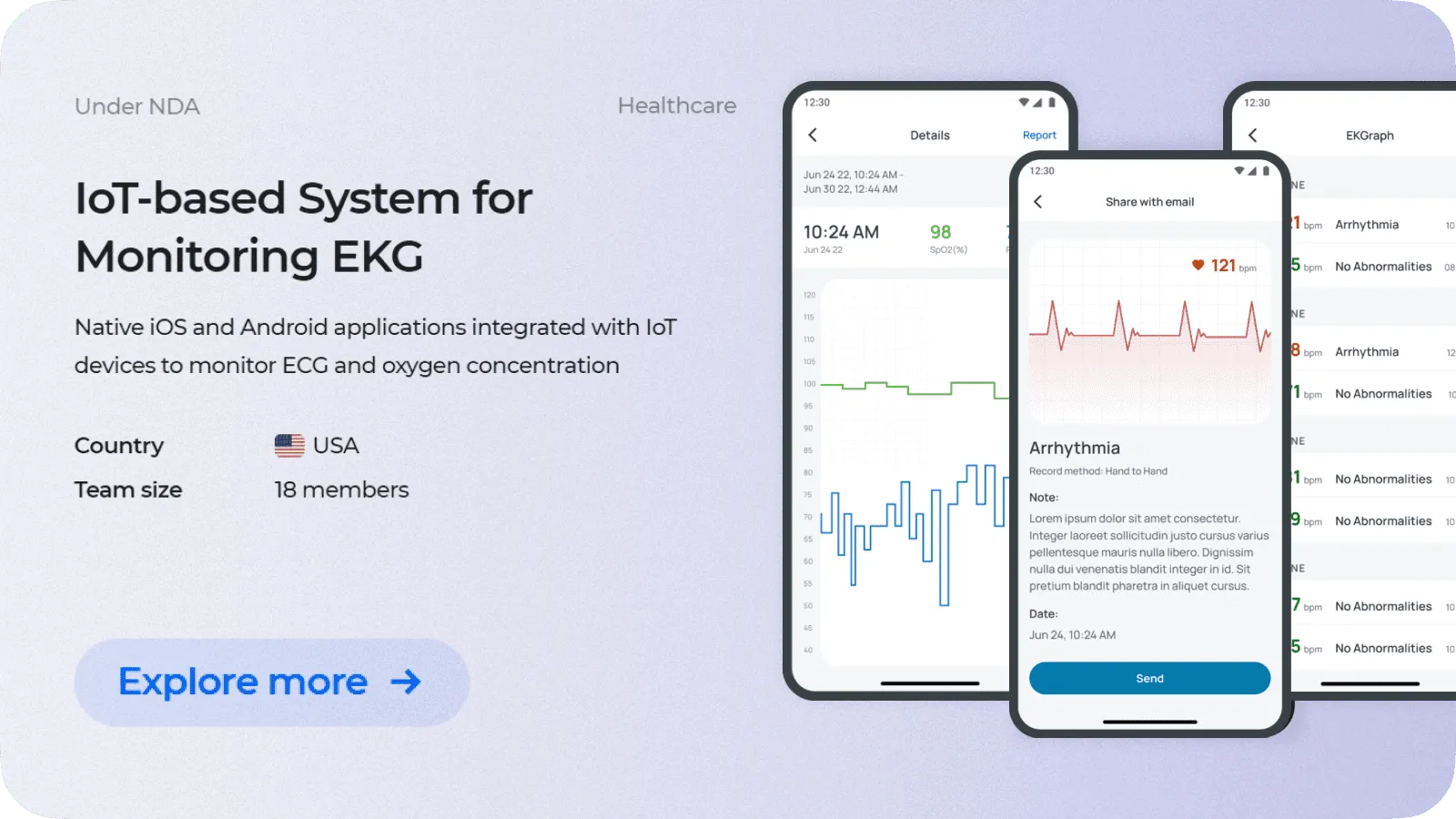
IoT-based System for Monitoring EKG and Blood Oxygen Level designed by Cleveroad
To optimize our clients’ time and budget, we offer several cooperation models to select from:
Staff augmentation. This model allows you to expand the capabilities of your in-house team by hiring a few additional specialists with expertise in the areas you need. In this case, you pay for the work of a specialist according to the formula of 8 working hours per day per specialist multiplied by the hourly rate.
Dedicated team. This model allows you to hire an entire team to do a certain amount of work. These specialists will not be part of your internal team but will report on the job done to you or your CTO/PM. Payment under this model is also carried out according to the scheme of 8 working hours per day multiplied by the hourly rate.
Fixed workshop. This model is ideal for projects with well-defined requirements and deadlines. After receiving the estimate and planning the development on Discovery, you pay for the time spent creating your solution.
Time and materials. This model offers more flexibility than the previous one, and estimates are created for each successive sprint based on the amount of work planned. You pay for development hours according to the hourly rate.
You can contact our Healthcare subject matter experts for assistance if you need to create a solution for visualizing health and healthcare data. Our team will help you identify all your requirements, select the best collaboration model, and create a unique solution to improve your efficiency and healthcare delivery.
Need an app for data visualization?
Contact our experts to create health data visualization software to improve patient care
Healthcare data visualization implies using visual representations such as charts, graphs, and interactive dashboards to understand complex healthcare data clearly. It involves converting large amounts of healthcare-related data into graphic formats that medical professionals, researchers, administrators, and patients can easily interpret and analyze.
Importance of data visualization in healthcare implies improved decision-making an patient outcomes, and facilitated the data analysis process. By visualizing data, healthcare professionals can identify main patterns, trends, or correlations that may not be immediately apparent in raw data. This helps identify anomalies, track disease outbreaks, monitor patient conditions, and identify opportunities to improve healthcare processes.
The most common healthcare data visualization types are:
- Medical dashboards
- Interactive apps, sites, and widgets
- Charts and graphs
- Infographics
- 3D volume rendering of a skeleton
- Electrocardiogram (ECG)
- Heatmaps
Benefits of healthcare data visualization include:
- Improved perception of data
- Better patient care
- Professional visualization of medical device data
- Improved decision making
- Identifying trends and patterns

Evgeniy Altynpara is a CTO and member of the Forbes Councils’ community of tech professionals. He is an expert in software development and technological entrepreneurship and has 10+years of experience in digital transformation consulting in Healthcare, FinTech, Supply Chain and Logistics
Give us your impressions about this article
Give us your impressions about this article