How Mobile-First Web Design Is Different From Adaptive and Responsive
Updated 14 Feb 2023
5 Min
3008 Views
The mobile-first philosophy is simple: the design is initially created for mobiles and only then adapted for desktops. It goes against a well-established practice when bigger screens go first. This technique helps to create elaborated mobile interfaces that can be adapted for desktops later.
With this approach, there’s no such thing as a crudely-made mobile version, poor layout of elements, or incorrectly working links. In this post, we're going to talk about differences of mobile-first web design with adaptive and responsive.
Mobile-First Design Vs. Adaptive and Responsive
First off, let’s take a closer look at such concepts as adaptive and responsive design to understand how mobile-first design is different.
Adaptive Design
Adaptive websites are made of several layouts. Each layout has a different placement of elements tailored for various screen sizes. When a user opens the website, the browser’s engine defines their screen size, resolution, and aspect ratio. These factors work as triggers helping to pick and display a suitable layout.
So, how do designers work with that? They simply create different layouts for different screen sizes:
- 4’-6’ — layout for smartphones
- 7’-11’ — layout for tablets
- 12’ and over — layout for desktops
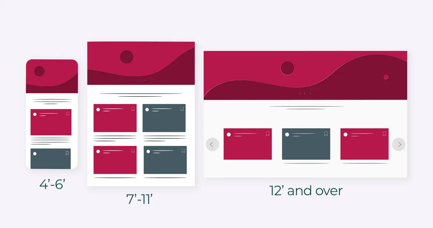
Example of layouts in adaptive design
Responsive Design
In responsive design, the website’s layout is shrinking or expanding according to users’ display width. Even if the window is changing in one pixel, the page will slightly rearrange its elements.
This approach lets save time and money on designing the mobile version. Yet, it’s important to make sure that all elements look good on different devices.
Design process differs from company to company. Here’s how we work with UI/UX design at Cleveroad.
Adaptive and responsive designs are alike. They both adjust to different screen sizes. The difference is that in responsive design the content is fixed in size, while in adaptive design the content is changing dynamically.
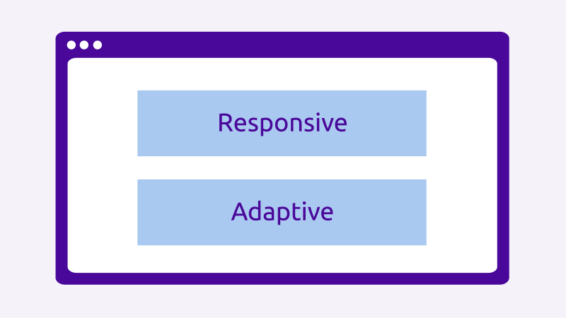
Responsive and adaptive design difference (Source)
Mobile-First Design
One of the issues with responsive and adaptive designs lay in an old-fashioned approach of creating a website for desktops first and then adapting it for mobile devices. As a result, mobile pages often look worse.
The mobile-first strategy works conversely: mobile devices come first and then the design is adjusted for desktops. Designers following this strategy, go from smaller to bigger screens. It’s basically all about providing the right user experience for the appropriate devices.
The main goal of this approach is to place all the necessary content — buttons, texts, CTAs, features — on the limited space. And all these elements should be put in the right place to be accessible and viewable.
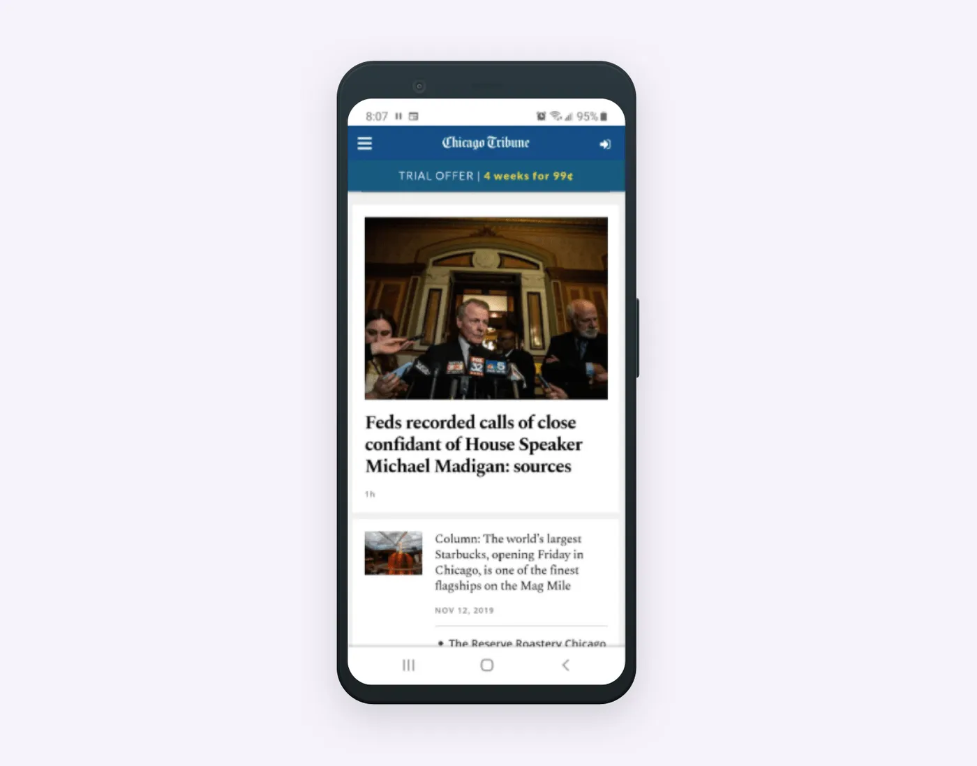
Chicago Tribune was one of the first media to follow mobile-first design
Why Mobile-First Design Is Essential for Business
Conversion rates on mobile devices have grown 64% compared to the average conversion on desktops. That’s why you can increase your business revenue with the mobile-first strategy.
Looking for more design techniques? Here’s a short guide on how concepts can help you build a better product.
What's more, Google is now scoring mobile versions of websites more closely to understand how to rank them. So this approach makes a lot of sense if you’re planning to launch a new project.
This approach also encourages fast access to content for your users. The fewer elements on the page, the less time it takes to load it. Given that each second of delay leads to a 7% decrease in conversion, you should at least consider mobile-first design.
So, the mobile-first website is good because:
- Google ranks it well
- Pages load fast
- User experience encourages fast purchases
Working With Content
Content is in the spotlight when it comes to mobile design. With the mobile-first approach, your UI/UX design team should provide users with the content they need. Having strict space limitations, designers have no choice but to remove all unnecessary UI elements to focus users on the main.
Speaking about unnecessary UI elements, we don’t mean you have to remove them from all website versions. They can still be useful for the desktop version.
The needs of mobile and desktop users differ. Desktop users often look for more detailed information or features that have no sense in mobile websites.
Again, the main goal of mobile-first design is to place buttons, features, CTAs, and other elements in the places where they’ll be useful.
Tips for Creating a Mobile-First Design
All the tips we’re going to reveal are covering the work with content as it takes the central part in mobile designs.
So, here are several tips to help you deal with this design approach easier:
- Make up a list. Draw up a document or spreadsheet with the full list of content that you’d like to place on the website.
- Prioritize the content. Important elements from that document or spreadsheet will go to the most visible spots.
- Be consistent. Encourage your team to start wireframing/designing from the smallest to the biggest screens gradually increasing the artboard’s size. This way, your team will cover all screen sizes from mobile to desktop version.
- Increase the tappable area. It’s essential because fingerprints are significantly wider than a pixelated mouse. So all clickable and navigational elements should be bigger. For example, Apple recommends making tappable areas of 44px. Make sure that hyperlinks and interactive elements have enough space and slightly enlarge them if needed.
- Think of it as it is a mobile app. Users got used to certain patterns of interaction with apps. Think through the navigation, widgets, AJAX queries, and other elements users can interact with.
- Avoid large and complex graphic images. Landscape photography and complex graphics are poorly displayed on tiny screens.
- Typography. Make sure that important texts are no less than 16pt in size. Also, make the line spacing sufficient for comfortable reading.
- Don’t forget about the safe content area. Content shouldn’t stick to screen edges. Apple recommends spacing pf 16px to avoid this.
Wrapping Up
Neglecting mobile-first design is a UX sin these days. Good user experience should be at the heart of your product. This strategy is considered to be one of the most perspective and complex approaches. It’ll fit commercial organizations, services, and other products that rely on the modern fast pace of life.

Evgeniy Altynpara is a CTO and member of the Forbes Councils’ community of tech professionals. He is an expert in software development and technological entrepreneurship and has 10+years of experience in digital transformation consulting in Healthcare, FinTech, Supply Chain and Logistics
Give us your impressions about this article
Give us your impressions about this article